
Design is a tool with which you can draw attention of consumers to products and increase sales . Packaging design helps to present the product in the most attractive light. High-quality packaging design helps you understand what the product is for, how to use it and, most importantly, makes you want to buy it.

Packaging design: key questions
To create a sales packaging and label design, you need to answer 3 questions.
1. What product is it designed for? When creating a label and packaging design, it is necessary to take into account the main characteristics of the product. For example, fragile items require tight packaging that can protect against mechanical damage.
2. Who is his target audience? Are they men, women, or does the product fall into the unisex category? It is also important to know which price segment the product is intended for. All of these factors influence the choice of packaging design. For example, when developing a packaging design for a luxury product, it is necessary to use elements that inspire thoughts of luxury: restrained colors, embossing, etc. Products can be targeted at environmentally conscious people. In this case, natural materials should be used for packaging design.
3. Under what circumstances do people buy products? Know where to buy a product: supermarket, boutique, small or large retail. Packaging design is perceived differently depending on where it is the consumer will see. The consumer’s reaction to the packaging that the buyer sees on the Internet and his reaction to the same item on the store shelf may differ.
You can find out the preferences of consumers by ordering a marketing research. Contact the KOLORO branding agency and get a quality analysis!
Packaging design has a significant impact on sales. About 60% of consumers pay attention to the product because of the attractive packaging design. Another 50% of consumers are ready to buy unnecessary goods for the sake of beautiful packaging.
The packaging redesign also helps boost sales . The English brand Dorset Cereals was engaged in the production of breakfast cereals and was not very popular. Its cost was 4 million pounds. After the packaging redesign, the brand value has risen to £ 45 million.
Packaging that sells: what’s special about it
1. Tallinn Doors Chocolate. The packaging design of this product tells a story. Each chocolate bar serves as a kind of door to old Tallinn. This design is popular with both locals and tourists who want to find original souvenirs.

2. Essense dairy brand. The brand’s designers went against the canons and did not make packaging in light colors. It is the absence of such traditional elements as the image of animals, jugs and jugs that makes this dairy brand stand out from the rest.
3. Little Dish baby food brand. To boost sales, the brand has revamped the illustrations on the packaging to make them more colorful. As a result, Little Dish sales grew by 17% over the year.

4. Wine brand La Sonrisa de Tares. The brand’s designers decided to attract the attention of consumers with an unusual design. Labelkevin features an abstract geometric illustration. Thanks to harmoniously selected colors, it compares favorably with competitors.
5. Wine Neptuno Malbec. The striking collage on the label attracts attention at first sight. The designers used an unusual illustration that plays up the brand name. It depicts Neptune, the sea, a mermaid, and all this against the backdrop of outer space. Brand information, subject to this way, attracts more attention than plain text.

Development of packaging design: main trends
To create an attractive packaging design, it is necessary to take into account current trends . In 2017, these include the following.
1. Simplicity and clarity. In an ever-changing world, shoppers don’t always have time to scrutinize packaging. Therefore, one of the main trends has become maximum simplicity . This means a minimum of packaging details and only important product information.

2. Fonts. Unusual fonts can distinguish packaging from other products. The specially designed typeface is akin to handcrafting, it evokes emotional attachment . Also, the font is able to emphasize the features of the product. For example, curved, flowing lines go well with water-based products: toners, serums, lotions.

3. Unusual colors. Color is known to evoke certain emotions and influences purchasing decisions . Therefore, the choice of color is one of the most important stages of packaging and label design. Bright colors and associations have become a modern trend. Sometimes it is difficult for the consumer to remember the name of the product, but he remembers that the product was sold in a box of a certain color.
Various shades of the same color can be used to design packaging and labels for the line.

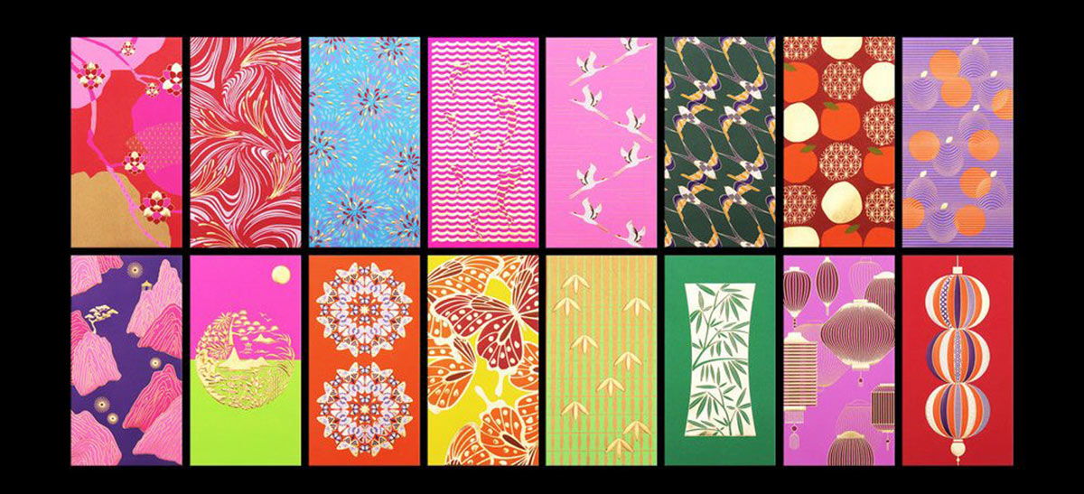
4. Use of patterns. Correctly selected patterns can make packaging designs more colorful. As a pattern, you can use a motive that reflects the inner essence of the brand. For example, a leaf-shaped pattern will emphasize the naturalness of an eco-brand.

5. Illustrations. There is a story behind every product design. A plot illustration is a great way to communicate it to the consumer. Also, illustrations help to tell about the product , to reveal its unusual sides. The illustrations on the packaging help to create a certain brand image and give it a cohesiveness.

6. Post Elements . There is a growing trend to design packages in the form of postal parcels. Most people associate postage with distant countries, travel and souvenirs.
For example, the Kokomo brand produces coffee. The grains for it are harvested in different regions of the world. For each variety, a package design with individual postage stamps was created, unique for each region. This gives the consumer the impression that this coffee was specially grown for him.
7. Viewing windows . Traditional packaging hides the contents of the box, and this is not to the liking of many customers. They want to know what the product looks like on the inside. Therefore, packaging design with viewing windows is popular. This way the buyer can see the contents of the package and be confident in the quality of the product.
8. Vintage. Vintage design has been popular for many years. It brings older consumers back to their youth. Young people get the opportunity to touch another era.
9. Naturalness. One of the main trends of the 21st century is the fashion for a healthy lifestyle. People choose foods that are free of harmful additives and preservatives. This is reflected in the packaging design as well. You can emphasize the naturalness of the product by using discreet, natural colors for packaging.
10. Portability. The pace of life of modern people has accelerated. They spend most of their time at work or various training courses, not at home. Therefore, there is a growing need for small-format packages so that the products can be carried with you at all times.
To develop a selling packaging design, it is necessary to take into account the individual characteristics of the product itself. In our blog, you can read about creating a candy and alcohol packaging design.
The packaging design can make the product special and unique! You can find out the price of packaging design development from the KOLORO agency managers (contact window in the lower right corner).
How to design a label: basic rules
Designers call packaging and labels the face of the brand . Thanks to them, you can show the inner essence of the product, reveal its main characteristics. To develop a high-quality label design, it is necessary to take into account such rules .
1. Harmonious composition. There are many elements to put on the label:
- obligatory information (expiration date, barcode, production address, etc.);
- logo;
- additional information about the brand.
All these elements should be in harmony with each other and combined in the space of the label.
2. Free space. Gone are the days when it was necessary to fill every millimeter of a label. The feeling of space and airiness is a new trend in label design. A balance must be struck between filled and unoccupied areas. An overabundance of information irritates buyers.
3. Hierarchy of information. It is psychologically determined that a person perceives information in a certain order. This also applies to the choice of goods. People also want to get the information they need as quickly as possible. Therefore, the information on the packaging must be positioned in such a way that the buyer can read it in a few seconds. These factors must be taken into account when developing a packaging design. For the consumer, the most convenient location of information looks like this:
- element to attract attention;
- brand name;
- product name;
- product information.
Create packaging design: new horizons
It is a well-known fact that when creating a package design it is necessary to target the target audience of products. At the same time, the opinion of some consumers was not taken into account for many years.
When designing products for children, many manufacturers focus exclusively on the tastes of parents. Manufacturers are afraid to contact the child directly. At the same time, children can be actively involved in product selection . In addition, the child will have to use such products, which means that the design should be pleasant to him too. Tactics like this can be applied when designing packaging for children.
- Using simple plots. Children, especially in kindergarten and primary school age, find it difficult to keep in mind multilevel stories. Therefore, the packaging design must reveal one specific aspect. For example, on the packaging of ice cream, you can draw the process of its consumption.
- Game elements. It is very important for children to interact with the world. An example would be the packaging of water from the Y Water trademark. The title plays up the question Y? The pronunciation of the letter Y is consonant with the pronunciation of the word “why” (why). Why choose this particular product? Because kids want to have fun, and packaging should help them do that. After the water is consumed, the bottle can be used as a constructor element. The bottles can be connected to each other and, thus, build the desired structure. Y Water sparkling water is designed for children, so there is no advertising information on the packaging itself. Y logo only. Brand information is included on an attached label that can be read by parents.
- Guiding Characters. A variety of characters can be used to get your child’s attention and interest. They are easy to remember and evoke feelings of affection . The character can become a companion for the child, who explains how to properly use a particular product.
Marketing Packaging Design Conclusions
- Packaging must be visible . It can stand out with an unusual shape, bright colors or images. Many consumers come to the store for products of a certain, already familiar brand. An unusual design can make people interested in a new product and consider it.
- When developing a product packaging design, one should not forget about functionality .
- Packaging design should evoke positive emotions .
You can order packaging design at KOLORO branding agency. Take a step towards success with us!