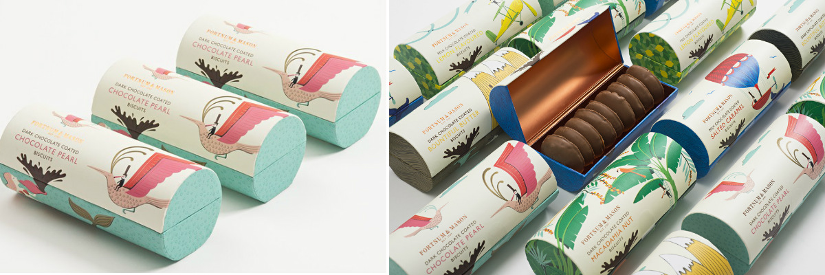
Cookies are a popular treat. In Ukraine, its consumption has been steadily growing since 2014. This is due to the drop in chocolate sales as prices for it increased. Ukrainians are switching to more economical sweets: semi-chocolate and caramel sweets, pastries, etc.
Packaging is one of the tools to increase product sales. If it has a central idea, humor, communicative element or a call to action, the chances of purchasing the product are increased. Packaging is especially important for new brands that are just entering the market. At the first stage, the consumer does not know anything about your product , his name does not have the authority of a well-known brand. It is the packaging that will be the decisive factor when the consumer chooses a new brand.
You can read more about selling packaging in our article.
In this review article, we’ll take a look at different cookie packaging designs , from the economy segment to the exclusive lines. There are several options for product positioning for each category. The design and materials of packages in different price categories differ greatly from each other. We will focus on the main design options and tell you about interesting and non-standard solutions from different parts of the world.
Cookie Packaging Design: Simple Solutions
One of the most popular packaging options is flow-pack (flexible packaging) – packaging made of synthetic film, foil, cardboard and paper. It is ideal for medium to large packaged biscuits (200 grams to kilograms). Also in the flow-pack can be individually packed portions of cookies, the main packaging of which is a cardboard or metal box. These include BelVita brand products, for example.
Usually, inexpensive cookies are packed in flow-pack, since this package has a low cost price. We’ve picked 3 striking examples of flexible cookie packaging designs that look stylish and stand out on the shelf.
Lyons Cookie Packaging Design
The Lyons brand produces more than 10 types of biscuits with and without fillings. He redesigned it a couple of years ago. Each species received its own primary color. And the unity of the product is emphasized by a blue geometric insert at the top of each package. Lyons’ cookie design is very simple. Geometric shapes and a vibrant but not acidic color palette, however, are paired with mouth-watering cookie prints and produce great results. The result is a simple but noticeable package. She attracts attention and sparks interest and a desire to try the product.
Design of packaging for cookies “For charging” and Biskids – play motifs in children’s products
Another 2 examples are the Russian brand of cookies “On Charge” and the American Biskids. We have combined them in one block, because the central idea of both brands is activity and cheerfulness. “For charging” – cookies designed for children from 2 to 14 years old and their parents. The designers were faced with the task of creating a brand that can compete with foreign brands, as well as demonstrate the naturalness of products and their usefulness.
The Biskids have a similar story. These are healthy cookies, no preservatives with a minimum of sugar. To make it more attractive to children, the creators came up with active and mischievous characters for each of the 5 representatives of the line (3 of them in the photo).
Both brands successfully completed the task. One glance at the packages is enough to recharge with the cheerfulness and playfulness with which they are impregnated. So, thanks to the clever design, healthy cookies, wrapped in fashionable packaging becomes attractive to children.
If you need to create packaging designs for baby products, contact KOLORO. We know everything about children and their interests.
Cookie Design: Communicate and Conquer
Another common practice in food branding is calls to action as part of packaging or even brand names. One of such cases is the Russian biscuits “I Recommend”. The positive characterization of the cookie and the motivational appeal are included in the title. There are also positive characteristics on the packaging (“what you need for tea,” for example). For 3 lines, 3 ambassadors -senters were invented: Ilya Petrovich, Iraida Robertovna and Petya Verevkin. All of them, each in their own way, praise cookies, enlivening the brand image in the eyes of consumers.
“Recommend” cookie packaging design
Jammie Dodgers are cookies marketed as an option for a quick bite. That is, all kinds of chocolate and energy bars compete with it. Typically, such products are promoted based on energy recharging to reach new heights. The Jammie Dodgers took a different, less popular approach. The brand idea is based on the unique taste of the products. And the slogan was the phrase “Love at the first bite” (from the first bite). To focus on this thought, bright colors and the shape of the hole in the cookie were chosen. Instead of the standard round notch, the center of the Jammie Dodgers has a small heart. The label “Best Ever Recipe” (the best recipe ever invented) confirms the information about the taste. Well, to satisfy the curiosity of people who take care of their bodies, an infographic about the amount of calories, proteins, fats and carbohydrates was brought to the front side. This customer care always benefits the brand.
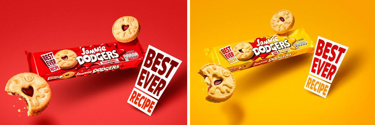
Jammie Dodgers Cookie Packaging Design
Humor in cookie packaging design
Buying confectionery is always associated with internal strife and self-digging. Usually, manufacturers do not focus on this, but try to build the brand image on cozy evenings, a festive atmosphere, romantic themes, etc. Bloomsberry & Co has taken a bold step. They put on the packaging all those thoughts with which each of us soothes ourselves when buying junk but tasty food:
- One more can’t hurt;
- It’ll make me happy (it will make me happy);
- Tomorrow I’ll go to the gym (tomorrow I’ll go to the gym).
There is no product photo or comments on its taste on the packaging. The company logo is placed at the bottom, it is much smaller than the phrase in the center of the package. The boxes themselves are decorated with stylish designs of catchy flowers that catch the eye of everyone who sees them. This is how the company emphasizes the status of a high-end cookie that needs no introduction.
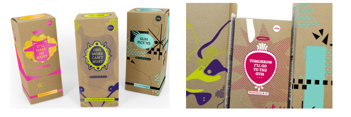
Packaging design for cookies by Bloomsberry & Co
Another option for using irony in design was proposed by the founders of the Früute family confectionery. Witty phrases about cookies and life take center stage in their cookie packaging. For example, “Cookies are proof that life is good”, “Doesn’t it work? Eat a cookie “or” A cookie a day, and you don’t need a doctor. ”

Früute Cookie Packaging Design
Luxury Cookie Packaging Design: Create a Successful Look
Products of the premium and luxury segments dropped very slightly in sales during the 2014 crisis. By 2017, this segment has already recovered from the shock, and the level of sales has almost returned to the original level. This behavior makes this category the most promising for creating new brands. Premium product design is always different from the low and mid-price segment. First of all – materials and construction . For cookies of this category, the most popular are tin boxes, packages made of thick cardboard, intricate packages of fancy shape.
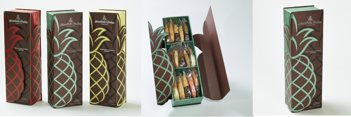
Honolulu Cookie Company Packaging Design
Honolulu Cookie Company presented packaging for its cookies, which mimics its shape (pineapple). She is presentable and bright at the same time. It is usually difficult to achieve a combination of these two characteristics. Therefore, the packaging of Honolulu Cookie Company is doubly remarkable.
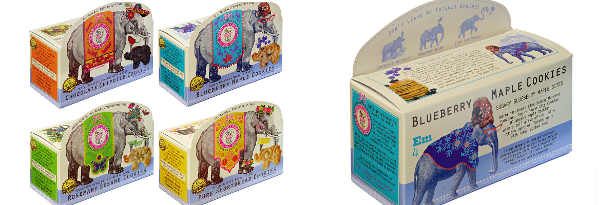
Queen City Cookies packaging design
Queen City Cookies are exquisite cookies that cannot be overlooked on the store shelves. It will be striking, even if there are hundreds of other options nearby. The packaging of the series with elephants is incredibly bright. There is both a strong individual story of each member of the line (name, color scheme, content illustration), as well as a common theme. I would like to mark the appeal at the top of the package. It reads: “Don’t leave my friends behind.” Usually, motivational phrases about collecting a collection can be found on a series of children’s toys. Incorporating such a call into a cookie package is a great idea. Queen City Cookies implemented it perfectly. Below the caption there are illustrations with other elephants and names and rulers. In addition, the company focuses on natural products . This is also noted on the packaging.
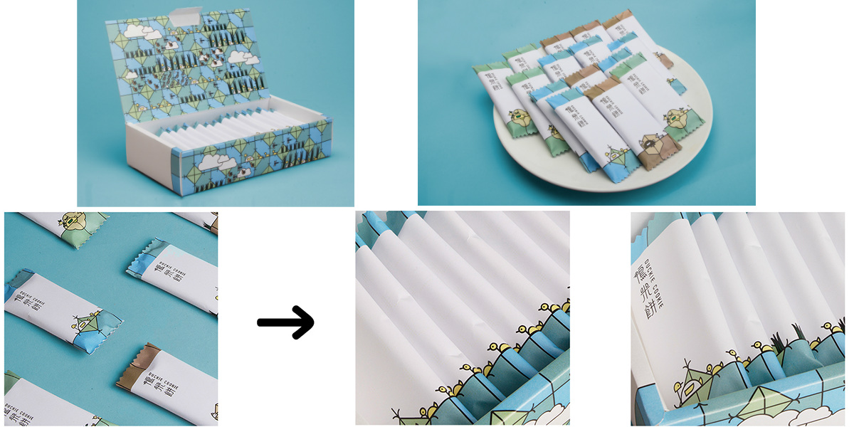
Duckie Cookie Design
Another example is the Taiwan Duckie Cookie design. The creators decided to use packaging design for educational purposes. In the center – the idea to show in the illustration how rice is grown and how ducks are related to this process. The inside of the box contains a detailed illustration map that tells the story. Well, the cookies themselves are packed in individual packs that together form one picture. This is an example of the merger of marketing and science lessons.
Packaging Jovial Biscuits
Cookie Packaging Design: Watercolor Dreams
Watercolor is a design trend that has been popular for several years. Jovial cookie packaging is an illustration of its appropriate use. The basis is white, in the center there are mouth-watering photos of the products. The image is completed by a watercolor insert at the top of the package, which tells about the shape of the cookie. All three elements are simple and well-known to everyone, but the designers managed to combine them into a perfectly sounding trio. There is nothing superfluous in this package, it is a example of correct design .
If you need to develop a design for confectionery packaging, contact KOLORO. Your sweets will become the best sellers!

