
Product packaging is, first of all, communication with the consumer. In milk design, it is important to build on a solid idea, not just make a pretty picture. Before taking on the design, you need to clearly decide on the positioning of the product on the market. If this is a new brand, develop positioning, if an existing one, adhere to its concept.
It is important to make the most of the packing space . A cardboard box for this purpose has 4 sides + a sole and a top, on a plastic one – 2. A glass bottle is most likely 2 communication panels: a label and a back label. However, it also leaves room for imagination.
The main color for milk packaging design is white. It is he who is associated, both with the product itself, and with purity, naturalness. Packaging should not be completely white. A good addition would be green or blue.

They favorably set off the main color, the ideal ratio of white and contrasting color is 70/30. When designing milk packaging, light, vigorous shades are needed. Dark blue or olive will not work. There is also a third, additional color – red. It is used to grab the attention of the consumer.

Milk elements are another design element for milk and dairy products packaging. This includes blooming green meadows, rivers of milk, any variations on the theme of a cow, bells and stylized packaging for retro packaging. Characters invented specifically for the dairy brand will also be appropriate. The main thing here is to observe the measure. It is important that the overall concept of positioning a new product is in harmony with the packaging.

Freshness, naturalness, useful information
The right color combination in milk packaging will help emphasize freshness. The wrong shade of brown or green color that will resemble mold can destroy the positive effect of beautiful packaging. Grass and green images are important. They are needed to forget about the industrial origin of milk.

When designing packaging for dairy products, it is important to consider that it must appear “cold” when handled. This gives the consumer the feeling that the product is fresh and increases the confidence in the product. Images of water droplets on packaging can help create this association.

The naturalness of the product is evidenced by the inscriptions-markers: “Without milk powder”, “Z vіdbіrnogo milk”, “Well known yakist!” Ideally, use numbers, for example, “100% fresh.” This also includes the marks of product quality – production quality certificates.
Additional communication
Most likely, the consumer knows that milk contains calcium and other beneficial elements. However, it is worth mentioning this again. Information about the fat content of the product is also important, it should be clearly visible, possibly highlighted in an additional color. The back of the package usually contains information about the composition, place of production, and other technical characteristics of the product. However, all of the above information is not the only thing that can be indicated on the packaging.

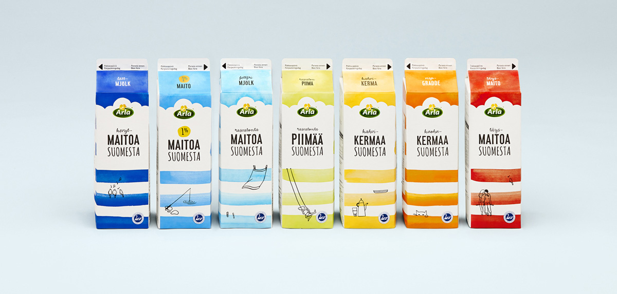
The Swedish company Arla Foods is a great example. In addition to information about the health benefits of milk, on their packaging every month there are new series of stories with illustrations. One of their projects is milk packaging with information on why people get depressed and how to deal with it. They also released special packaging for Earth Day, a series about dinosaurs, human face sensing, the interaction between humans and nature, scientific technologies, and respect for the environment.

More popular is the creation of packaging designs for dairy products with a history. This approach is especially true for baby products. These can be small fairy tales about characters from packaging , often they are associated with contests or collecting souvenir magnets / cards, etc.
Eco
Every day the consumer becomes more and more demanding of product quality. The wave of fashion for organic products reached Ukraine five years ago. In Europe and the United States, this trend has been present since the 1980s and does not lose its relevance. This also affects the design of milk packaging. Accents on environmental friendliness are reflected in the inscriptions “From the manufacturer”, “This GOST”, “There is no freshness.” The slogan of the Ukrainian food manufacturer “Chumak”: “Z lana to the table” is an excellent example of focusing on naturalness. Recently, there have been more frequent remarks “Zrobleno in Ukraine” or variations on this theme.

Go out of bounds
Each brand should have its own distinctive feature, thanks to which the product does not get lost on the shelves among similar products. If possible (information is text, not a character or a combination of colors) it should be highlighted in large letters, special fonts and markings.
 0
0
It’s equally important to be bold and go beyond boilerplate designs. This could be a new form of packaging or additional design elements. All parts of the packaging should be used, not just the front and back . Even the bottom of the bottle / box can be used.
esign – contact KOLORO! We can help you create the perfect packaging for your milk or dairy product line.