The Olympic Games are not only a world-class sports event, but also an important image project for the host country. State governments and city halls spend significant funds on the preparation and holding of competitions. And if some are counting on a return on investment due to an increase in the tourist flow after the end of the Games, then for others the Olympics is primarily a matter of prestige.
In any case, the organizers aim to make the sporting event bright and memorable. An important role in this is played by the identity of the Olympic Games – the emblem, posters, medals and the official mascot.
KOLORO branding agency will develop a high-quality logo and corporate identity for your brand. This will help you become recognizable in highly competitive markets and firmly gain a foothold in the mind of the consumer.
Based on a brief excursion into history, we will analyze the most successful examples of Olympic identity, as well as mistakes made by the developers of emblems and posters.
History of Olympic logos and symbols
The main symbol of the Olympic Games – five crossed rings – was developed by the founder of the modern Olympic movement, Pierre de Coubertin in 1913. Alternative versions are credited with the authorship of the Greek artist Angelo Bolanchi and the Swiss psychoanalyst Carl Gustav Jung. But their supporters cannot provide confirmation of these theories.
Historians differ on the first logo. Some believe that the Germans were the first to introduce the official emblem at the Olympic Games in Berlin in 1936, while others insist that the logo of the 1932 Summer Olympics in Los Angeles should be considered as such. Although the first graphic symbol of the competition was designed by the French, it was not used in posters and paraphernalia for the 1924 Games in Paris.
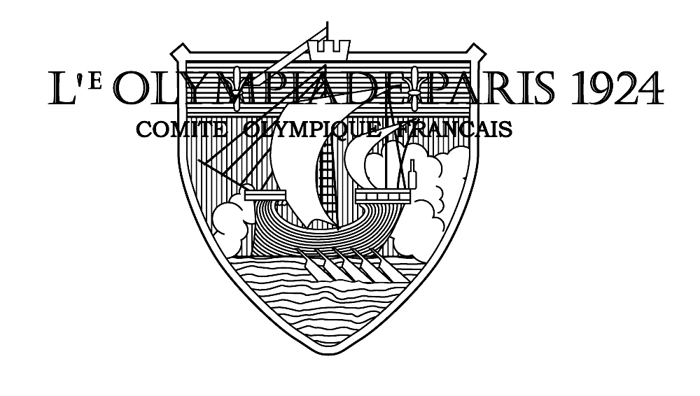
Emblem of the 1924 Summer Olympics in Paris
Olympic Games Logos
The Olympiad logo, in addition to the mandatory rings, the name of the place and the year of the competition, contains a graphic symbol. It is he who serves as the main element of the identity, reflecting the characteristic features of the host city or country. Often, the logo contains additional ideas that the organizers want to convey to the audience.
Logos based on national symbols and city landmarks

Emblems and logos of the Olympic Games with national and city symbols
Los Angeles 1932. The main background is the American Shield, one of the state symbols of the United States. The number of stars and stripes on it corresponds to the number of states in 1776. In the foreground are the Olympic rings, the slogan of the Olympics and an olive branch. The latter, in addition to being one of the symbols of the Olympic Games, is also depicted on the US coat of arms. The head of an eagle is turned towards it, which symbolizes the desire of the American people for peace.
London 1948. Westminster Abbey and Big Ben are the central elements of the emblem. The hands on the dial show 4 o’clock – the time of the official opening of the games. The inscriptions are made in one of the classic English fonts, which adds an additional national flavor to the logo.
Rome 1960. This emblem is exclusively associated with the host city. The central element of the logo is the symbol of Rome – the Capitoline wolf. The pedestal bears the inscription “1960” in Roman numerals.
Moscow-1980. A combined emblem, where one of the symbols of the host city – the building of Moscow State University – is made in the form of running tracks converging at a five-pointed star.
There is a hidden ideological component in the logo. The summit has three levels, which corresponds to the number of steps on the podium. The top step is occupied by a five-pointed star. This symbol of the USSR is crowned with the spire of the Moscow State University building, but on the logo it denotes the leadership of the communist ideology. In addition to the five-pointed star, the national anchor of the logo is provided by the red color.
Los Angeles 1984. Another example of a combined emblem that successfully combines sports and nationality:
- the five-pointed star is a symbol of the United States and at the same time represents the human desire for excellence;
- the number of stars corresponds to the colors of the American flag and corresponds to the number of winners on the podium.
Stripes in the emblem add dynamism to the composition.
Apparently, American designers decided to keep up with Muscovites in using hidden meanings in symbolism. The same size of stars indicates equality of opponents. But in the foreground is a star in the color of the US Olympic team’s uniform. This arrangement not only gives her a central place in the composition, but also demonstrates her high-speed lanes, hidden by the white and red stars.
At the same time, one should not look for hidden meanings in the fact that the red star is, in fact, in third place. Otherwise, the logo would not have read the white star.
Emblem of the 1992 Albertville Olympic Games
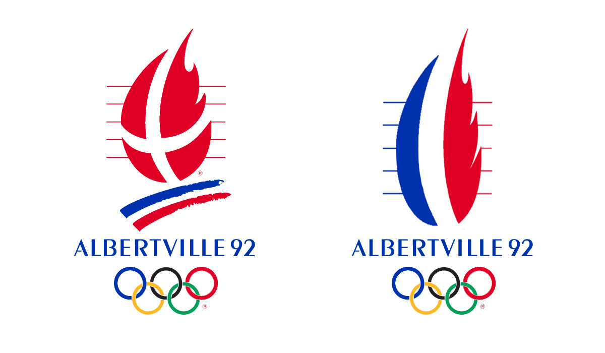
Emblem of the Olympic Games in Albertville
This example should be analyzed separately. In the left picture we see the original logo, symbolizing the Olympic flame. Many sports fans were interested in the question: why is the Danish flag used in the emblem of the French Olympics? Those familiar with French history will answer that this is the flag of the Duchy of Savoy, which existed in the south-east of France in the 15th-19th centuries. A white cross on a red background is depicted on the coats of arms of the department of Savoy and Albertville itself.
The presence of the French national flag was supposed to provide three stripes under fire. They symbolize both the torch bowl and the ski trails at the same time, creating an additional connection to the Olympic theme. However, due to the angle of the slope, these lines more closely resemble the inverted flag of the Netherlands.
See also: How corporate identity helps increase the price of your product
In general, the concept of the logo is clear and justified: unlike the football championships, the logos of which are based on the colors of the national flag, in the Olympic emblems the main emphasis is on the symbols of the host city. But in this case, the similarity with the Danish flag caused confusion among the uninitiated. However, the designers may have set themselves the goal of drawing attention to the history of Albertville.
But if the organizers aimed to focus on national symbols, the logo would also look expressive. If you look closely at the option on the right, then in this case the text and the Olympic rings play the role of the torch bowl.
Localized Logos
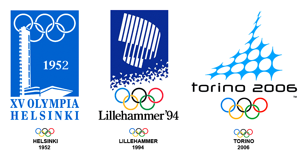
Olympic logos featuring local attractions
Helsinki-1952. The emblem depicts fragments of the stadium that was supposed to host the 1940 Summer Olympics, which was canceled due to the outbreak of World War II. Therefore, this symbol has a double meaning: it indicates the location of the competition and embodies the strength and continuity of the Olympic movement.
Lillehammer 1994. The main element of the emblem is the stylized image of the aurora borealis. In addition to referring to local specifics, this natural phenomenon symbolizes the spectacle, power and high tension inherent in sporting events as well. The lower part of the logo symbolizes ice crystals, which indicates the specifics of the competition.
Turin 2006. The emblem is a stylized image of the Mole Antonelliana tower – the main attraction of the city. The specifics of the competition are indicated by the snowflake stars that make up the dome.
Read also: 30 best logos in history
Emblems containing a snowflake image
This symbol is often used in the emblems of the Winter Olympics. In addition to indicating the theme of the competition, the snowflake represents symmetry and precision.

Using snowflake in Winter Olympic emblems
Separately, I would like to dwell on three logos.
Sarajevo-1984. The central place in the emblem is occupied by the element of Bosnian embroidery, which brings an element of national flavor to the logo. Such a symbol resembles both a snowflake and four people opening their arms to the sun. In this case, it would be logical to change the design by adding another person.
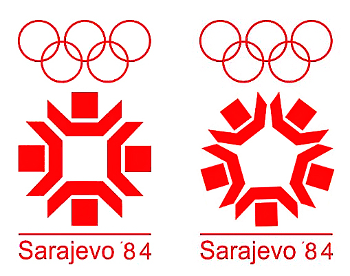
Creation of the Olympic Games logo Sarajevo 1984
One could also paint them in the colors of the Olympic rings, creating an additional connection to the sports theme. However, such a symbol would be similar to a Soviet star. Although Yugoslavia was officially considered a socialist country, relations with the USSR were rather tense. In addition, following the Western boycott of the 1980 Moscow Olympics and the Soviet Union’s intention to boycott the Los Angeles Olympics, such associations would also not benefit the image of the competition.
Calgary 1988. This emblem also reads a national theme. The snowflake and its color are reminiscent of the state symbol of Canada – a maple leaf, the stem of which is indicated by a vertical line at the bottom of the snowflake.
Nagano-1998. The logo has three symbolic meanings at once:
- A snowflake symbolizing anchor to a topic.
- The snowflake beams are made in the form of figures of participants of the main winter sports.
- The main theme of the Nagano Olympics is respect for nature, therefore the symbol resembles a flower. In Asian culture, the number “6” symbolizes harmony and natural balance. Therefore, the flower snowflake has six petals, not five. In addition, if you tie a flower to the Olympic theme, then one of the petals should be black. Although it is the color of joy in Japanese culture, it is not typical of flower petals.
Draft Olympic Games 2024 Emblem
15 cities submitted applications for the 2024 Olympics. Rome, Paris, Los Angeles and Budapest reached the final.
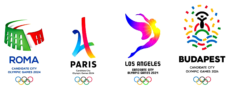
Logo Design for the Olympic Games 2024
Rome. The emblem depicts the main attraction of the city – the Roman Colosseum. The 3D image is stylized to resemble the national flag of Italy. The stripes at the top of the symbol represent movement and speed, giving dynamism to the logo and indicating the specifics of the event.
Paris. The emblem is a stylized image of the Eiffel Tower. The lines are dominated by blue and red colors. In combination with a white background, the image of the national flag of France is read between them.
Los Angeles. The symbol clearly identifies the host city. The angel is directed towards the sun, which in this case symbolizes the movement towards high results. However, the wing of a butterfly can be interpreted as both rebirth and impermanence.
Budapest. The emblem combines the symbols of water (the Danube river, on which the city stands) and the sun (a symbol of light, peace). The image of a man with open arms represents hospitality and a desire for high results. The logo contains all the colors of the Olympic rings, which indicates the theme of the event.
Rome and Budapest refused to host the Olympics for reasons of economy, and the Los Angeles authorities decided to participate in the competition for the right to host the 2028 Olympic Games in their city. Therefore, Paris is automatically the winner.
The main function of the logo and corporate identity is to clearly and concisely express the brand’s philosophy and fix it in the mind of the consumer. The specialists of the KOLORO branding agency help the business to successfully cope with this task.
Olympic poster design
Olympic posters are sort of an extended emblem. If the logo should be laconic, then in the official poster the organizers have the opportunity to more fully reveal the peculiarities of the city and country hosting the competition. The poster can also implement a creative idea that will make the Olympics memorable not only for sporting events and achievements.
First Posters
Official posters of the games appeared with the start of the Olympic movement.
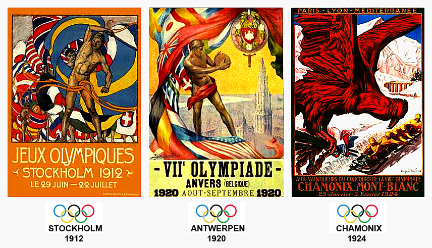
First Olympics posters
The main idea of the first posters was the Olympic spirit and the unity of nations around sports.
Posters of the 1936 Berlin Olympics
The Third Reich put sports competitions at the service of Nazi ideology. As conceived by the Nazi regime, the Berlin Olympics was supposed to be a triumph for the Aryan race. Nazi ideologues reworked Friedrich Nietzsche’s doctrine of the “superman” to justify the domination of the German nation over the rest of the world.

Posters of the 1936 Berlin Olympics
On the posters, we see the collective image of a “true Aryan” who was supposed not only to reinforce the ideological indoctrination of the German population, but also to work appropriately for a foreign audience.
Posters for the 1972 Munich Olympics
The development of the identity for the Olympic Games was entrusted to the renowned German graphic designer Otl Aicher. The result of its work should be considered as a whole.
Munich 1972 Olympics logo and poster
On the left in the picture you can see the logo of the competition. As conceived by the author, it was supposed to symbolize:
- the Olympic torch bowl;
- a serpentine climb with the Olympic flame on top.
But the audience was presented with only a two-dimensional version, in which the vast majority saw only the sun with broken rays or the same deformed snowflake. The second interpretation would be more likely if it were the logo of the Winter Olympics.
It can be assumed that Otl Eicher’s concept would have been clearer if one of the three-dimensional variants were used for the logo.
Associations with winter competitions can also arise when looking at the official poster. It is dominated by white and blue colors, and the stripes resemble a blizzard more than the rays of the sun.
The concept of sports-specific posters was more favorably received by the audience.
Sports posters of the 1972 Munich Olympics
Vancouver Olympics 2010
On the main poster, half of the space is taken up by a white background, which indicates the winter theme of the Games. The second part is decorated with the symbol of Canada – a maple leaf, which depicts the country’s natural attractions.
Posters of the 2010 Vancouver Olympics
Similar landscapes also serve as the background for the images of athletes on the posters of certain Olympic disciplines.
See also: Ads filmed for 2018 Superbowl
Unsuccessful design decisions in the design of the Olympic posters
Olympic posters with bad creative ideas
Saint Moritz 1948. The idea of the identity of the first Winter Olympic Games after World War II is clear. The logo depicts the sun as a symbol of peace. The designers of the Olympics poster took the idea further: it depicts two people on skis, looking at the rising sun, as a symbol of the beginning of a peaceful era. However, it is located on the left side of the composition, therefore it is perceived not as a sunrise, but as a sunset.
London 1948. Like the logo, the poster features Westminster Abbey and Big Ben Tower. The link to the Olympic theme is provided by the image of the ancient Greek statue “Discobolus”. The image of trees makes the composition ambiguous. The ragged outline and color of this element makes it look like smoke and dust from an explosion. Therefore, the poster hints at the Nazi bombing of London during World War II.
Mexico City 1968. In the logo, the name of the city and the numbers are stylized as treadmills. The Olympic symbol fits neatly into the numbers 68, although the black and green rings merge with the dark gray text.
The main poster is made in the style of an optical illusion. But in this case, the overall composition does not have a holistic character. The letter “I” divides the image into two uneven parts. If you look closely at the poster, then all the waves can be connected in such a way that the composition looks whole.
Albertville 1992. The Olympic symbol in the logo is in broken lines. The black and red rings appear more consistent than the blue ones. This, together with the tilt and shape of the rings, visually resembles the numbers “88”. Such a technique would be good for the 1988 Olympics.
Posters based on original design solutions
Original ideas in Olympic posters
Three Olympic posters deserve special attention:
Lake Placid 1932. The background for the ski jumper is a white map of the United States. If you focus on the sea at the edges of the circle, then the image can be perceived as mountains, against which the skier makes a jump. In this case, the point on the map with the name of the city behind the athlete’s back is perceived as the sun.
Lillehammer-1994. The abstract spots on the poster not only depict the torchbearer, but also resemble the winding shores of Norway, cut by fjords. Therefore, the poster also indicates the tourist attractiveness of the host country.
Turin 2006. In the coloring of the slalom tracks, there is a reference to the Olympic theme, and their shape is similar to the triangular logo of the Turin Olympics. In addition, the symbol of downhill skiing acts as an addition to the slogan: “Passion lives here.”
Posters based on community ideas
Social messages in the posters of the Olympic Games
Each of the posters contains additional messages:
- Posters for Helsinki 52 and Calgary 88 indicate the tourist attraction of the host cities, essentially serving as an advertising poster.
- The 1952 Oslo Olympics is the second winter competition after the war. At this time, the Cold War is also unfolding. Ski poles as flagpoles and flags waving against the blue sky are a symbol of peace.
- As mentioned, the theme of the Nagano Olympics was environmental protection. Therefore, a bird on ski poles is a call for a harmonious relationship between man and nature.
Identity of the Pyeongchang Olympic Games
Emblem
The Olympics logo, designed by the designer Ha Jong Joo, consists of two stylized hieroglyphs:
- “ㅍ” means three harmoniously coexisting elements: Heaven, Earth, Man;
- “ㅊ” symbolizes snow and ice, indicating the theme of the Games.
The hieroglyphs are painted in the colors that are present on the flag of South Korea and correspond to the colors of the Olympic rings.
Poster
The official poster of the Games has not been approved, but the most common is the poster with the mascot of the Olympics. A mosaic background in a blue color scheme creates a thematic link. In the upper left corner is the slogan of the Games, which can be translated as “Passion. Connection established. ”
As we can see, identity is not just the outer shell of a brand or event. Logo, printing and packaging have a significant impact on the attitude of the target audience to your product. Using the examples of the Olympic identity, we saw that the development of identity must be taken seriously.
Branding agency KOLORO has extensive experience in the development of logos and corporate identity for various brands. Based on desk marketing research, our specialists will develop an effective strategy for promoting your brand that best meets the market specifics and the needs of your target audience.

