In the previous article, we wrote about the branding of e-cigarettes, vaping liquids and vape shops. Today we will dwell in more detail on the design and features of packaging for vaping liquids. It should be said right away that liquids are a product with high margins, the manufacturer’s net profit is from 30 to 50 percent.
At the same time, there is an incredible variety of liquids, and in order to stand out against the background of a couple of dozen identical strawberry or banana cocktails, you need to be different in serving. Packaging will help with this. The label design also adds value to the product.
We reviewed the design of juices that are included in the ratings of the most popular liquids, world leaders, as well as the mid-price segment of liquids.
Premium vaping fluid packaging design: debriefing
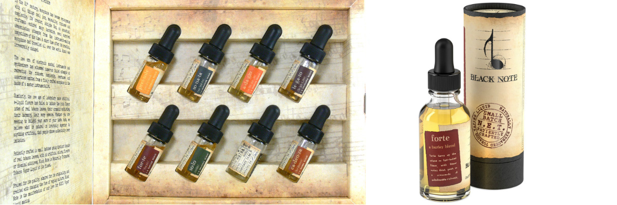
Black Note e-liquid label design
Black Note is an American premium brand that regularly makes it to the top of the fluid ratings for quality, popularity and sales. The label design of this juice is very thoughtful, with a mature composition. It is important to note that the brand was clearly built according to plan, as all the elements are interconnected. The name – literally translates as “Black Note”. Each of the line’s names is a musical term (Prelude, Forte, Sonata, Legato, Solo, Quartet).
The background of the label is a faded field that looks like a sheet of music. The graphic part of the element is a black treble clef.
Each of the packages is stamped with text about the manual production of the liquid and its quality.
Contact COLORO and your brand will be as organic and thoughtful as our first example. We will help you develop a vaping e-liquid strategy and design your packaging.
Five Pawns Juice Label Design
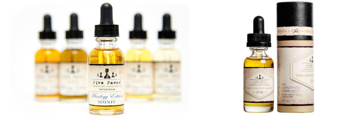
Another premium fluid we’d like to share about the design is Five Pawns. This is an American brand, the design style of which has something in common with the previous example. There are burnt-out colors here as well, and references to handicraft. We’ll tell you more about them.
All fields, including the name of the line and the date of production, are filled with retro fonts, and on the outer container-tube there is a signature of the person who is responsible for the production of the batch of liquid. A similar system is used by the handmade cosmetics brand Lush. This trick works for niche manufacturers of mid-plus and above products. This approach strengthens the brand’s connection with the consumer, establishes emotional contact, and increases trust in him.
Read also: Alcohol design: 8 trends you missed
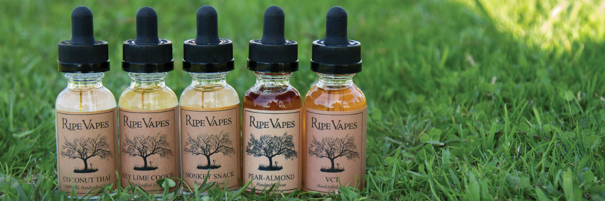
Ripe Vapes label design: tree of knowledge and gift wrapping
The design of the Ripe Vapes label (the closest translation is ripe steam or matured steam) also includes echoes of the past. This is reflected in the craft label and black typographic illustration that might just as well be found in a 17th century manuscript. The creators also thought out the outer packaging for the set. Since this is a premium liquid, they opted for a wooden box filled with filler that protects the glass bottles from damage.
For vaping e-liquid box design, contact KOLORO. You can read how we do this in the corresponding service.
N. B. It is important that all 3 top e-liquids brands are aimed at middle-aged people with an upper-middle income, their designs are discreet and discreet.
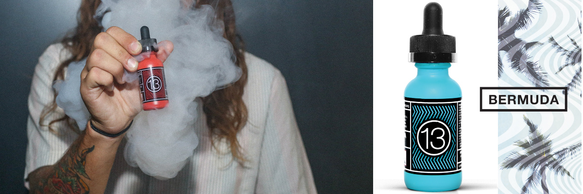
13th Floor Elevapors vaping fluid design: youth and joy
13th Floor Elevapors is a premium fluid that targets a younger audience. This is confirmed by both the brand’s philosophy (freedom, desire to travel, praise of uncompromising) and the look of the label. Dynamic lines in the center field and acid colors are associated with the music of the 80s and emphasize the playful, freedom-loving image of the brand. They also pair well with the promise in the brand name (a play on words that hints at flying in the clouds at the 13th floor).
Vape Juice Design: Cuttwood Brand Inheritance Technique
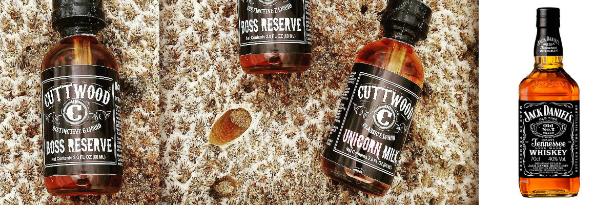
Another interesting interesting and important example is the Cuttwood brand, the appearance of which evokes strong associations with the Jack Daniel’s label design. The move is not entirely fair, but successful. The product at the subconscious level is perceived by the audience as of high quality. At the same time, there is no direct plagiarism here; rather, there is imitation.
Styling the Vapor Linear: Cultural Appropriation in Action
The creators of the Ronin fluids (a term from medieval Japan, a samurai who lost his social weight as a suzerain and was forced to become a hermit) took a simple path. They built the brand image on a famous legend from the Japanese Middle Ages. So on the label, you can find illustrations with recognizable images that are associated with Japan. For example, Tsunami fluid depicts a wave, which is a stylization of the work of the artist Katsushika Hokusai – “The Great Wave off Kanagawa”.

Vaping Fluid Logo Design: Brutalism and Versace Echoes
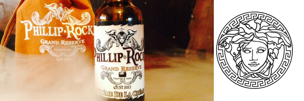
Another interesting example of vape liquid label design is Phillip Rocke. The company plays with biker motives, the logo fonts are quite aggressive, and the rims of the label resemble the emblem or coat of arms. The top of the package features a head that suggests antique statues and the Versace logo. She completes the brand image.
The combination of biker and antique motifs is not the most obvious solution, but in the complex the logo and label look organic and easy to remember.
See also: Psychology of font perception or how to manage consumer mood
Medium Price Vaping Liquid Label Design
Design of a bottle of vaping liquid: the shapes are banal and not very good
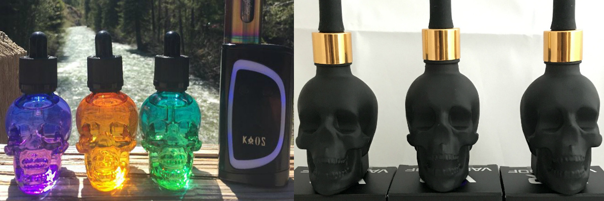
The most classic packaging for liquid is a glass jar. It is used by all the brands that we wrote about above. The second most popular is the plastic container, it is cheaper and packaged in it self-mixes, liquids of low, sometimes – middle price segment. However, there are other options.
In the previous article, we mentioned an unusual form of packaging for e-liquids from Ukrainian manufacturers VapeRoof. And while preparing this material, we stumbled upon the American premium brand Scull Tonic. Their packaging is also in the shape of a skull, but not matte black, but transparent, with multi-colored tints, depending on taste. By the way, packages of different shapes can be found on Chinese websites that wholesale polyester clothing, cosmetics of dubious quality and fakes Louis Vuitton and Nike Air Max.
The unusual form of packaging is a unique selling proposition (USP) on the liquid market (until the American Skull Tonic is brought to the Ukrainian vape shop). KOLORO will help you to develop an unusual shape of a vape liquid bottle. Contact the agency, we will create a solid 3D model and set up the production of bottles, which will have no analogues on the market.
N. B. Curly bottles have their drawbacks – they cannot be used for mini versions of juice. The design of the vaping liquid probes is as important as the main jar. A simple label for any of the liquids we described above can be easily produced in a smaller format and pasted onto a plastic bottle. Casting mini-samples into the shape of something will be problematic, and without this skull, part of the brand image will be lost, and the consumer impression will not be complete.
Liquid vape label design: greetings from the 2000s
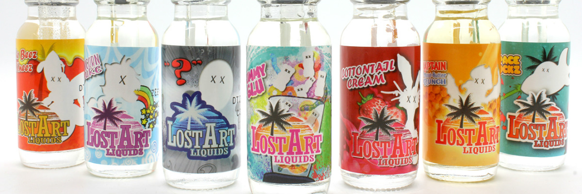
Lost Art is a liquid that perfectly conveys the mood of California: eternal summer and Venice Beach. The style of collage illustrations is a variation on advertising images of the early 2000s. It’s a fashion trend that came from the streets and was taken up by global brands (Fanta and Dirol redesigned their packaging in a similar style in mid-2016).
See Also: Into the Past: Retro Logo Rebranding
Vapor label design: flat logo
The Russian brand Kitchen Steam was developed for a small concept bar. Not only the slurry packaging is designed in a similar style, but also craft beer. Also, the logo is present on all media of the corporate identity of the institution. In the center of the idea is a character, a bearded tattooed vaper. The idea is good, the mock severity of the character is both amusing and touching. And if the packaging of the product evokes feelings, it works.
KOLORO branding agency provides label design services for vape liquid. You won’t miss with us!
Contact information: tel: +380442235120
 0
0
It is medically proven that vaping is harmful to health, although not as badly as smoking. This article is not a propaganda of steam, but informs about trends in vape liquid label design.

