
What color should I paint the store with? If you’ve asked these questions before, this article is for you! Choosing the color of the store’s corporate identity is a responsible decision for any minimarket, and even more so for a supermarket. After all, color is one of the most powerful non-verbal communication tools. It is important to use colors correctly and understand the meaning of each of them.
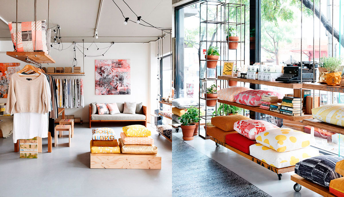
Photos of the interior of a home comfort store
Color should reinforce the positioned brand image and evoke certain emotions. Consumers quickly form a subjective opinion about the brand as a whole, judging only by the store’s interior design. A correctly chosen color increases recognition and in 85% of cases determines whether a person enters a store.
Read about how to influence shopper behavior in our article here. You will find 11 best examples of how to positively influence customers, causing them only positive!
Store interior design: what color tells customers
Most people perceive different colors the same way. Therefore, there are many studies devoted to the study of color perception and associations with each of them. Consider the primary colors: what emotions they evoke , in which industry they are used and how they communicate with consumers. We will also give recommendations on the use of these colors in store interior design.
Purple
Purple is the best color if you want to create a creative brand image. It is chosen by ambitious creative people with a lot of imagination. From ancient times, purple – the color of royalty , and many rulers wore purple capes. It is a calming and relaxing color that evokes the anticipation of something refined, mystical, mysterious. The brand identity of the clothing store using purple will emphasize the luxury of the brand.
Positive associations
Since the days of kings, purple has been associated with wisdom , wealth , success, power and title. With the main color KOLORO purple, we are creating “royal” brands.
Negative associations
Poorly chosen shades can cause boredom . Also, mysticism does not evoke positive feelings in all people, and can cause fear.
Color keywords : creativity, imagination, kings, wisdom, mysticism, mystery, elegance, sophistication, luxury.
Application
Purple is used to highlight the royal quality or premium brand characteristics , its uniqueness or wisdom. Also, bright purple is used to advertise children’s products. This is due to the fact that 85% of children and adolescents prefer this color.
The B ila Camomile pharmaceutical supermarket chain uses a muted purple color in the interior design (pictured below). Plus, they successfully pair it with yellow, highlighting the sophistication of the brand. One of the main colors of the proStor chain of stores is also purple. It is worth noting the successful combination with pink. This is one of the best store interior styles with the main target audience of women .

Pink
Pink is almost as strong as red, appealing to sensitivity and passion, but does not evoke aggressive emotions. Pink conveys lightness, carelessness, fun, innocence, delicacy.
Positive associations
Bright pink is the color of health , youth , energy, fun, playfulness and joyful excitement. Light pink is associated with romance and a slight blush.
Negative associations
May be associated with youthful irresponsibility, frivolity, immaturity. In certain cases, a hint of femininity can also be negatively perceived. It doesn’t matter what colors the store is still using – the brand may still be perceived as weak or too young.
Color keywords : health, joy, femininity, compassion, playfulness, innocence, calmness, romance, gentleness, vulnerability, bloom.
Application
The addition of pink makes the look more sensitive and feminine , which is why it is used for retailing goods for women. Pastel shades of pink are used in the design of children’s clothing stores.
Children’s toys store Budinok igrashok uses pink as the main logo color and in store interior design. It is also the color of the brand of youth clothing for girls Kira Plastinina.
Red
Red is the most intense color that stimulates strong emotions ranging from excitement to feelings of danger. Restaurants and cafes use red because it whets the appetite. Red creates a sense of urgency or urgency, which is why it is the main color of all sales in large stores and supermarkets. It is also used to provoke impulsive shoppers . prone to rash purchases. Used in logo design to grab attention and is known for raising blood pressure in consumers.
Positive associations
Red color evokes such positive feelings: anticipation, passion, love, energy, drive . It is associated with adventure, courage, strength and warmth.
Negative associations
At the same time, depending on the context or shade, red is associated with danger, restriction, prohibition, war, and is often taken as a warning. Able to increase levels of aggression and anger.
Color keywords: action, courage, passion, rebellion, danger, blood, excitement.
Application
Used in the food, entertainment and sports industries. Great for creating an emphasis on certain supermarket products, drawing attention to discounts or sales.
Red is the main corporate color of the ALLO chain of digital technology and consumer electronics stores. It is used to decorate signs, showcases, stands. Promotional offers are highlighted in red letters on a white background. The same color was used for the site design (buttons, navigation, icons, etc.).
When developing a corporate identity for the Myasniy meat store , we used the color red, because it creates an appetite. Read more about our work here.
Orange
One of the most controversial colors, closely associated with red. People either hate it or adore it. Fiery orange instills energy and warmth and encourages action. It is used to stimulate mental activity. Combined with red, is used to attract attention. Call-to-action buttons are usually made orange – they look less aggressive than red, but also noticeable.
Positive associations
Orange is associated with fun and playfulness , showing brand friendliness and positive attitude . In some countries it is associated with luxury – in the Netherlands it is the color of the royal family. Many people associate “sun – sea – beach – relaxation”.
Negative associations
Contradictory by buyers, may be associated with restriction or prohibition.
Color keywords : joy, enthusiasm, frivolity, youth, creativity, fun, inspiration, success, encouragement.
Application
Just like red, it is used to stimulate impulsive buyers, can be used in the design of call-to-action buttons. Orange is the color of entertainment, so you can often find it in the decoration of children’s goods stores, on attractions.
Citrus chain stores of gadgets and accessories use a lot of orange. This is not strange, because orange is the color of many citrus fruits (oranges, tangerines, grapefruit). Using this name, color, and even fragrances (the store is filled with fresh scents) increases brand awareness. Orange is also the main signature color of the Welfare women’s shoe store. Such communication evokes energy and joy in buying and wearing shoes.
Blue
Blue is synonymous with security and financial stability and is used to emphasize that a brand is trustworthy . It is perceived as one of the symbols of life, because the water and the sky are blue. This is the favorite color of 42% of people., being the most acceptable for both women and men. Most of the rest of the people call blue among their other favorite colors. Blue is the most popular color in logo design. A shade of indigo blue (deep blue) associated with wisdom and spirituality .
Positive associations
First of all, blue inspires trust . He is also strongly associated with loyalty and loyalty . The color blue has a calming effect and peacefulness. Blue is often considered the color of intellectuals and is conducive to reflection and conscious thought.
Negative associations
Many shades of blue are associated with coldness and inaccessibility , chauvinism, or with carelessness and frivolity. It can also be associated with dampness, despondency and boredom. Blue is considered to be the conservative color .
Keywords of color : trust, strength, freedom, coldness, intelligence, loyalty, confidence, reliability, peace, calmness.
Application
Primarily used for branding services that are related to finance and security . It is used by banks, law firms, pharmacies, hospitals and airlines . It is not recommended to use blue or light blue in grocery stores and supermarkets as it suppresses hunger. It is often used in the field IT and technology .
The main colors of the MOYO digital solutions store are blue and black. In this case, this is a very successful communication – buyers of equipment want to be sure of the safety and reliability of the goods. Construction and utility hypermarket “Ep icenter” also in blue. This is another example of a successful association: building materials must be reliable.
Book Web Letter use cyan. It perfectly completes the association with wisdom and knowledge . The beauty and health store Cosmo also uses blue. Here he also reinforces the health concern association. The pink color on the logo hints at the availability of cosmetics and care products for women.
Turquoise is a rather sophisticated color. It has all the properties of blue, but is perceived as lighter and more cheerful. This is the main color of the brand and jewelry store Tiffany & Co , as well as the chain of perfumery and cosmetics stores in the luxury segment Brocard .

Green
Green is best perceived by the human eye and is even believed to have a revitalizing effect on vision. Green is the second favorite color among people. It is the color of the environment, peace and tranquility. Symbolizes vitality , renewal, is considered a symbol of fertility.
Positive associations
Associated with health, freshness, wealth and tranquility, safety. Natural green (from forest to lime color) is associated with harmony with nature. Light green helps to cope with negative thoughts, adjusts to the working mood and inspires.
Negative associations
May be associated with anger, envy, jealousy, and inexperience. In addition, it can produce a negative impression due to association with money (depending on the situation, this can be perceived negatively).
Color keywords: renewal, peace, growth, health, naturalness, harmony, luck, earth.
Application
Used by eco- friendly companies that position themselves in terms of caring for nature . Used in stores to create a relaxing environment. Also used in the design of corporate identity banks and pharmacies.
Read more about winning positioning strategies in our article here.
Green is used to decorate the Leroy Merlin building hypermarket, which creates a sense of calm and at the same time inspires. The pharmacy chain Good Day Pharmacy reinforces communication with health and recovery through the green color.
Yellow
Yellow is the color of sunlight that glows with optimism and joy. The hue of gold is associated with a positive future. Yellow is simultaneously associated with energy and creativity . However, yellow causes rapid eye fatigue and can make babies cry.
Positive associations
Represents the brand as young, evolving and optimistic.
Negative associations
Conservative people get the impression of being spontaneous, unreliable and unreliable. Therefore, serious companies do not use it, especially if they need to inspire consumer confidence. Too much yellow can cause anxiety and irritation.
Color keywords : energy, warmth, joy, light, sun, intellect, curiosity, positivity, hospitality, instability, irresponsibility, frivolity.
Application
Widely used in the entertainment industry as well as in the food industry. Grocery supermarkets Billa and Megamarket use this optimistic color. Yellow creates a sense of joy and stimulates spontaneous purchases.
Brown
Brown speaks of stability, reliability . It is the color of the earth and is associated with everything natural and natural . Adjusts for a serious relationship, mutually beneficial.
Positive associations
Associated with naturalness, tranquility, wealth , simplicity, comfort and convenience.
Negative associations
For many people, brown is the first association with dirt. In addition, it evokes feelings of excessive simplicity, haughty seriousness and rudeness, dogmatism and conservatism.
Color keywords : simple, rustic, earthy, stable, warm, comfortable, comfortable, rough.
Application
The use of brown creates a sense of oneness with nature, the naturalness of the brand. Can be used with green to show the company’s environmental friendliness.
WITTCHEN luxury leather goods store emphasizes the naturalness of its products with brown color. The interior of the Timberland shoe store is also decorated in this color. Since these shoes are most often bought for long hikes and travel, the brown color reinforces the association with the earth.
0
White
White declares purity, innocence, calmness, neutrality. Brands using white seem to say they have nothing to hide and are totally open to collaboration. This is the most versatile color.
Positive associations
Associated with purity, freshness, innocence, youth and well-being.
Negative associations
May be perceived as empty, limited, devoid of creativity or inspiration.
Keywords of color : innocence, purity, simplicity, peace, truth, sterility.
Application
White is used for logo inscriptions, shading it with bright or dark shades. In the interior design of many stores or supermarkets, white is the main color – it is very easy to perceive, does not distract attention and emphasizes other colors. There is a lot of white in the interior of a PANDORA jewelry store and Stradivarius (in combination with brown).
Black
Black speaks of a formal, elegant and prestigious brand . It looks dramatic and sophisticated . Black adds seriousness to any event, which is why it is not used for baby products. When combined with red or orange, it becomes menacing and aggressive.
Positive associations
Black is associated with authority, power and classics.
Negative associations
Black is associated with death, therefore it is not used in health establishments, hospitals, in entertainment centers. It can also be associated with negativity, fear, mysticism, anger, uncertainty.
Color keywords : classic, mystical, traditional, dramatic, elegant, formal.
Application
In retail, black is more commonly used for luxury brands targeting a specific consumer group. In combination with white, gold or silver, black is used even in the interior of premium supermarkets. The shops of NYX cosmetics and Pull & Bear clothing stores are decorated in black.
What is the best store color to choose to please the target audience
Most people’s favorite color is blue. It is preferred by 57% of men and 35% of women . In the first places are the natural colors – blue and green. In general, men prefer bright and aggressive colors and women prefer soft and muted colors . Also, men prefer shaded colors, while women prefer light shades.
Considering that men and women still have different color preferences, especially with regard to their shades, it is to choose the right color, appealing to women or men. This is essential for choosing the design of the facade and interior of the store .
Before choosing which color to paint the walls of the store, it is necessary to conduct a market research of the target audience. KOLORO conducts detailed market research to identify what consumers will like best.
Shop Interior Styles: Color Guidelines
Color influences shoppers during shopping and can significantly push them to buy. We have compiled a few guidelines for choosing colors in store interior design.
1. Tell a story with color
Instead of choosing an abstract color that the store owner just likes, can create a certain atmosphere in the store through color combinations. For example, the use of sand color in combination with azure, will evoke the memory of a vacation at the sea. Muted shades of green can take the buyer to the edge of the forest.
2. Draw attention with color correctly
Red can be aggressive, but it is also very eye-catching . It is recommended to use such bright colors in a very metered manner – no more than 20% of the total store space. For example, you can decorate shop windows or individual shelves with red. However, you should not use this color to decorate the entire store.
3. Use the same color everywhere
Using the same color (or scheme) strengthens brand awareness. If you use different shades, let alone your logo colors, in promotions, it significantly reduces your awareness and confuses consumers . Often confusion arises in supermarkets as to what color the logo should be printed on the poster. In such cases, you must always have a brand book at hand. In the KOLORO company you can order a brand book development service. This will be your complete guide to applying corporate identity . You can find colorful examples of brand books from popular stores in our article.
4. Take care of comfort and coziness
Warm colors (orange and yellow) attract customers because they look cozy. At the same time, they are energizing and energizing . Cool colors (blue and green) have a calming effect and relax customers.
5. Don’t overload with color
When using color inserts to grab the attention of consumers, remember that color should “highlight” the product, not obscure its brightness . It is better to display variegated wrappers on white, black or beige shelves, and dull and nondescript ones on bright ones.
What color to paint the grocery store
In grocery stores, it is better to use warm and bright colors – they are appetizing. However, yellow and red can make up a small part of advertising surfaces, and walls can remain white or beige. The use of blue or green is not recommended. First, they suppress hunger. Secondly, cold colors calm consumers down, and they may feel that they do not really want to walk around the store in search of something tasty.
What color to decorate a children’s clothing store
Children prefer bright, warm, sunny colors because they evoke a joyful and playful insistence. orange, yellow, purple, red is a good choice. However, if you are targeting young parents with very young children, it is better to choose pastel and muted shades of green, blue, orange or pink.
What color to paint the walls of the accessory store
The main color for accessories stores is usually either white or black . Complementing them with gold or silver, you can achieve the desired highlighting effect of jewelry. You can highlight important elements (for example, new items) with any other bright color. However, it is better not to use warm colors, as they can look cheap against their background. It is best to use the brand’s signature color or cold shades (green, blue, purple).
Clothing store colors to choose
Choosing the style of the interior of a clothing store is not as difficult a task as it might seem. First of all, you should consider the product itself – which colors are predominantly used when sewing clothes . It is they should be avoided when decorating a store, otherwise a beautiful green blouse will be completely lost against the background of a green wall. Light pastels are suitable for a lingerie store, dark shades of green and brown for a denim store. It is better for an evening dress store to recreate a festive event in the interior using the appropriate decor elements.
Selection of corporate colors and interior decoration of a store is a very delicate work that requires knowledge of the target audience and a long selection of colors. Sometimes it all depends on the shade 🙂
Please contact KOLORO to find the perfect color for your store or supermarket. Our designers are very sensitive to color and will select the best combination for you!