The modern Internet includes an innumerable set of sites in various directions. Sites allow you to chat with friends, learn new things, develop your business and, of course, watch movies and videos without restrictions. For the latter purpose, the vast majority of users choose YouTube. This site is one of the most visited in the world. But few are familiar with the history and logo changes of YouTube. We will cover this in this article.
Create your logo online . More than 50 thousand brands around the world are already using logos from Turbologo.
Create a logo online
Company formation
YouTube has been around since 2005. Initially, the site positioned itself as a unique dating site. However, it had a distinctive feature – users had to upload not a photo, as in a regular social network, but a video. This way, people could tell more about themselves and gain an audience faster. The company quickly gained popularity because it was the only site of its kind. This is how the well-known YouTube appeared.
Users began to upload various kinds of content to the site: entertaining, informational, educational, news, etc. Thanks to this, the site has become a major video resource.
The first YouTube logo
The red shape on the logo is depicted with a gradient and highlights. Further, the developers will refuse this effect.
Evolution of the YouTube logo
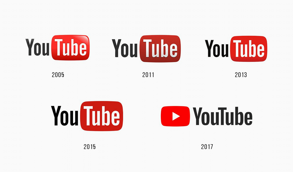 The next version of the YouTube logo was developed and released in 2011. Its difference from the previous version of the logo is a simplified design. The red shape is now presented with no gradient and less expressive volume. Its color has also changed – it has become darker.
In 2013, another rebranding takes place. The company logo reverts to a richer red figure. However, the volume of the rectangle is not very pronounced.
2015 – YouTube brand again slightly redesigns the brand name. This time, the designers resort to the maximum simplification of the shape on the logo. Gradient and volume disappear. The color of the rectangle becomes a couple of shades darker. The font and layout remain unchanged.
New YouTube logo
The company decided to reflect the modernity and relevance of the site in the updated brand name. Therefore, in 2017, there is a radical change in the YouTube logo. The developers get rid of the division of the inscription into two parts (now they form a single word), but each of them is written with a capital letter.
To the left of the company name, a red “Play” button appears, which reflects the specifics of the site – viewing and downloading videos. The shape also has the shape of a smoothed rectangle, but it is smaller than in previous versions of the logo.
The font of the inscription also changes: the letters are shortened in height. The space between the words of the name also disappears.
This version of the logo is relevant and is used to this day. It can be found both on the official YouTube website and on derivative services of the company: YouTube for Kids, Gaming, TV and Music.
How to make a logo for a YouTube channel
Currently, YouTube is no longer a place for simple video content sharing. Now it is also a platform for business development, popularization of their knowledge and skills, as well as for the formation of their own name as a unique brand. Therefore, more and more users start channels on YouTube and upload their author’s content to them.
A YouTube profile requires not only a sonorous and “speaking” name, but also a unique, attractive logo. It will allow visitors to remember your channel and in the future it will be easy to recognize it not only by the name, but also by the picture.
Logo for YouTube channel can be absolutely anything: there are no restrictions on colors and images on the sign. The minimalistic white website design with red elements will highlight the logo of any color and look. The main thing is that the logo matches the theme and characteristics of your channel.
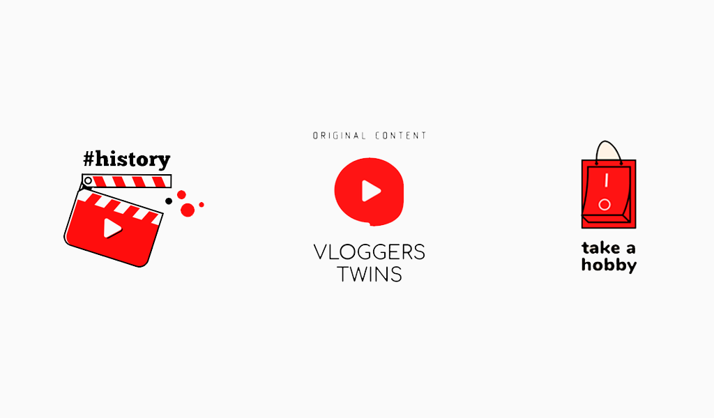
You can develop a logo for the YouTube channel in the online service Turbologo. The constructor allows you to create a unique brand name in a short time. And an automated development process will help create a logo design even with zero knowledge in the field of programming and design.
A gallery of ready-made logo templates for companies of all directions is also available to users. You can see examples of logo designs for the YouTube channel and create your own sign based on them on this page.
Summing up
Corporate identity of video hosting YouTube has undergone changes to eventually arrive at a versatile and stylish logo option. In addition, the company was looking for the perfect website design so that any channel would look bright and memorable against its background. Both tasks have been successfully accomplished. Now we see the product of the long and painstaking work of the YouTube team every day on their smartphones and computers. And the site’s logo is familiar to users all over the world.
Blog editor and content marketer at Turbologo. Victoria’s articles contain helpful tips on marketing, brand building and online promotion.

