
What is a logo?
Logo – a graphic image of a trade mark. It is created for easy recognition of the company’s brand among consumers.
The logo should be unique and of high quality, to attract the attention of the buyer. The logos were created to distinguish products from manufacturers from the same industry.
There are several types of logos:
- Letter logo – one or more letters are used.
- “Symbol” logo – displayed in the form of graphic or letter symbols.
- The “Emblem” logo is a graphic element of the image and text.
- Logoslovo logo – consists of letters only.
- Abstract Sign Logo – creates the visual form of a company concept using a symbol.
The first logo in the world
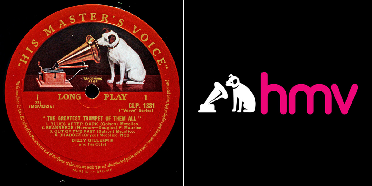
The first logo in the world was the image of a dog listening to a gramophone. The dog’s name was Nipper.
One of the brothers of the Barro family saw how the dog loves to listen to the Edison-Bell phonograph and decided to capture this moment by drawing the drawing “Dog listening to the phonograph”.
In 1900, Mark Barro’s brother, Francis, took Nipper’s drawing to a disc gramophone company. The owners of the company really liked the drawing and decided to release their goods with this image. But the original version of the drawing, which depicted a drum gramophone, was replaced by a disk one. The drawing became the first trademark of the companies: HMV music stores, RCA, Victor and HMV records. The company also began releasing records with Nipper’s artwork.
The logo now uses the music channel of the HWV store.
Evolution of global brand logos
Logos of world brands did not always look stylish and laconic. Some companies, even though popular with consumers, have redrawn their logos. Main reasons:
- rebranding;
- change of direction;
- following new trends.
Let’s take a look at some examples of the evolution of company logos.
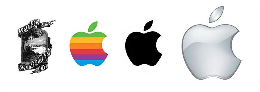
- Worldwide Apple
The first company logo was an engraving of Isaac Newton under an apple tree, which was wrapped around a large ribbon with the signature “Apple Computer Co” (1976-1977). The designer of this logo was one of the founders of the company, Ronald Wayne. After Ronald left, the logo was changed.
The second Apple logo was designed by Rob Yanov. Nothing remained of the old company logo, except, perhaps, the idea with a fruit falling on Newton’s head. Apple’s new logo is the Rainbow Bitten Apple (1977-1998).
The logo that we see now on Apple products was changed in 2007. “Apple” has become metallic with reflections, but the shape remains the same.
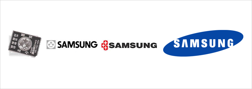
Samsung means “three stars” in Korean. The company was founded in South Korea. The first three logos used the stars and the Samsung name.
In 1993 the company decided to create a new logo for its 55th anniversary. It still exists today. It is a blue ellipse in the center of which “SAMSUNG” is written in stylized white letters.
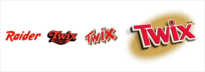
The first bars were produced in 1967 in Britain. They were called Raider. But a few years later, in 1979, the name was changed. Raider became Twix. After the name change, the products began to be exported to the USA.
The name Twix is made up of two words, double and biscuit. Twix bars are very popular all over the world. They are still sold in Ireland under the first name Raider.
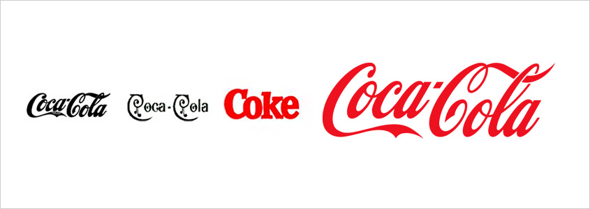
Coca-Cola has the most recognizable corporate identity for a logo that’s over 117 years old. The company was founded in 1886 and the logo in 1893. The company logo is written in Spencer calligraphy. It was created by Frank Robinson, an accountant and friend of the owner of the company.
In the early 1980s, due to competition from Pepsi products, it was decided to change the company’s logo to New Coke. After making this marketing ploy, the company began to lose sales. Consumers didn’t like the new name for the drink. After some time, the drink was returned to its former name Coca-Cola, thereby the company improved its sales.
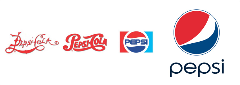
In 1903, the Pepsi-Cola trademark was created. Agree, the first logo of the company is not very pretty. We can say – a failure.
To prevent this from happening to your brand, you need to contact the KOLORO team of professionals who will help you make your logo perfect.
After the great depression of the 30s, Pepsi-Cola was able to prove to the Coca-Cola company that it can compete with it on the same level.
In 1962, the company changed its logo to a tricolor ball and also removed the Cola prefix. Now it is called only Pepsi. Nevertheless, the company logo changes very often. What this is connected with is unknown.
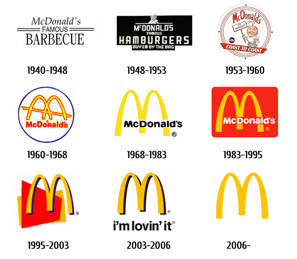
In 1940, the McDonald’s company was created. The first company logo is the image of the Speedee chef. Later, the Speedee logo was redrawn. In the 60s, Jim Spindler changed the company logo to the one we know today. And this is the letter M.
Logos of the fashion industry (famous fashion brands)
Almost everyone of us can recognize and name brand monograms. For fashion houses, the logo is very important because most of the fashion houses are named after the founding designers.
The fashion house was founded in 1854. The corporate logo of the company is LV monograms. The color of the monograms and the canvas could change, but the logo of this brand has not changed to this day, except perhaps a little simplified in the 2000s.
The clothes of the brand are made of very high quality materials and therefore the products are expensive.
Louis Vuitton brand products copy the most. But it is very easy to recognize a fake – in the original the brand logo is always arranged symmetrically.

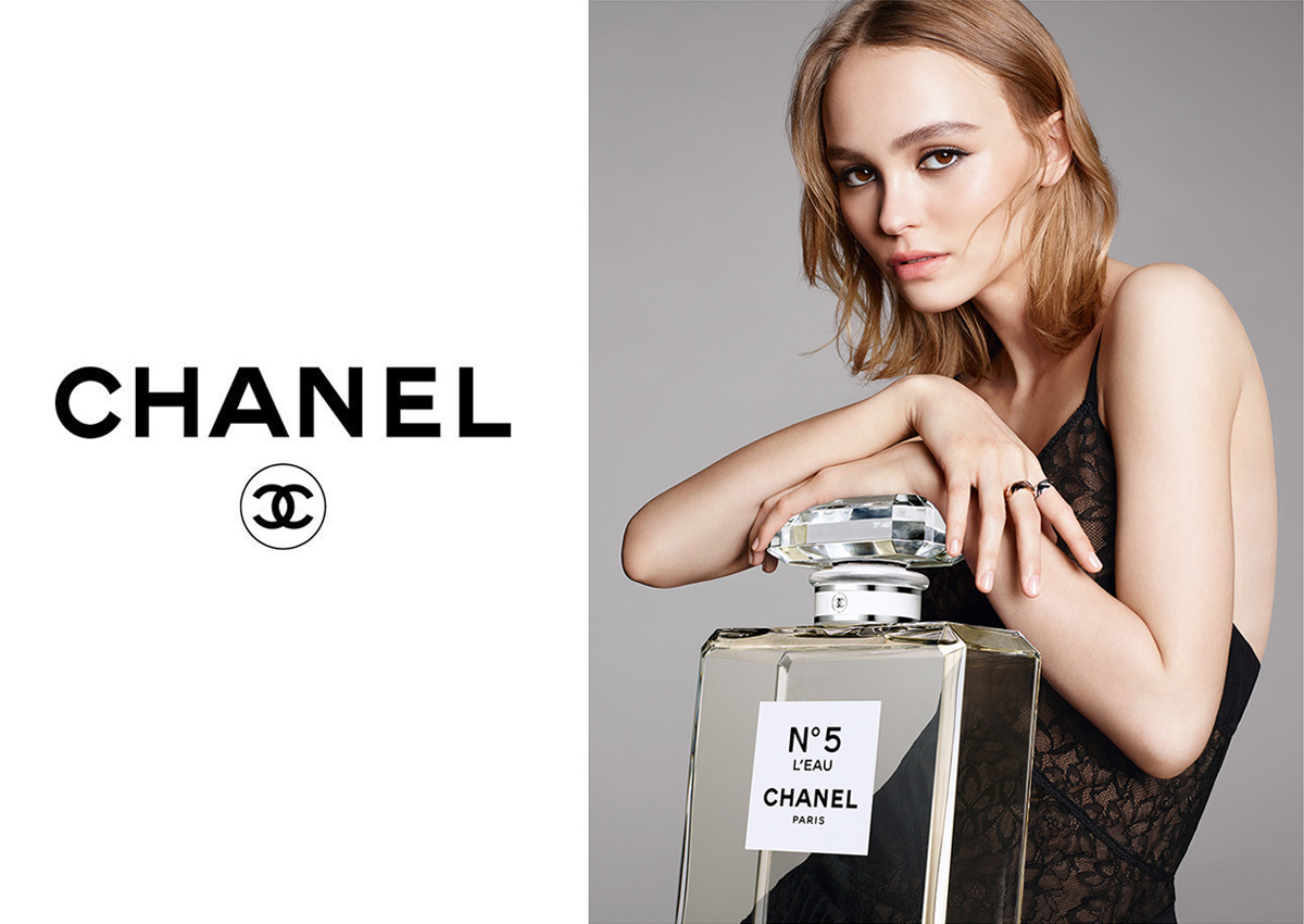
For the first time, the Chanel logo appeared in 1921. He was depicted on the bottle of Chanel perfume No. 5. The company’s logo is a double letter C. It resembles two wedding rings that are not closed together. The letter C is the initials of Coco Chanel.
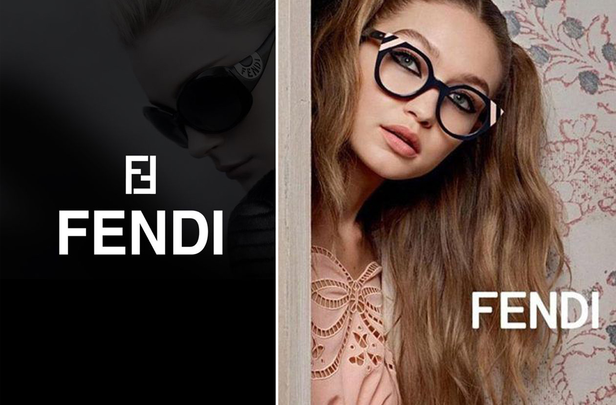
The Fendi logo was created in 1972 by the company’s new designer, Karl Lagerfeld. The brand logo is a large F that is mirrored.
The Versace house logo is very extravagant and extraordinary. It was designed in 1978 by Gianni Versace. The logo represents the head of the representative of ancient Greek mythology – Medusa the Gorgon. The designer explained why he chose this character: “This is a synthesis of beauty and simplicity, which can mesmerize anyone, just like the clothes produced by the brand.”
In 1952, the Givenchy brand begins to produce high quality clothing, as well as a line of jewelry and perfumes. The brand logo is very simple and concise. The four-fold letter G is placed in a square. It looks like Celtic jewelry.
Car Brands Logos
Winged cars:
Bentley is a British luxury car. The characteristics of the car can be described in just two words – aristocratic luxury. The car’s logo is the letter “B” enclosed in the wings. The emblem indicates the power, speed, elegance of Bentley limousines.
Aston Martin – the car logo was created in 1927. These are the eagle wings that frame the Aston Martin lettering. The owners of the company compared their car to an eagle. Because the eagle is fast, agile and a bird of prey
Chrysler – The first American car logo was a pentagonal star created in 1923. After joining the company to the German concern Daimler AG in 1998, the logo was changed to “wings wide open”. They demonstrate the virtuosity and uniqueness of Chrysler vehicles.
Cars with animal logo
Jaguar – whose emblem was originally SS – Swallow Sidecar. From English “swallow” means “swallow”. After the Second World War, most Europeans had negative associations with the SS emblem (association with the fascists), so the owners of the company decided to change the name of the brand. Swallow Sidecar replaced with Jaguar. You must admit that strength, elegance and grace are very suitable for modern Jaguar cars.
Lamborghini – at first the Italian company was engaged in the production of tractors. Therefore, the bull became the emblem of the company. This animal is very hardy and strong. Nowadays, Lamborghini cars are powerful, expensive supercars, and the golden bull emblem suits them very well.
Ferrari – the car logo of this brand is familiar to everyone. Its main attributes are a prancing black stallion on a yellow-gold background with a painted Italian flag at the top of the logo.
The original Ferrari emblem was on the plane of the pilot Francesco Baracca, during the First World War. Enzo Ferrari, asked Francesco to give him this logo. The pilot agreed and gave the right to use the logo to Enzo.
Best Music Industry Logos
Virgin is a British record label. Created in 1972 by Richard Branson and Simon Draper. The name of the label is very interesting. Virgin translated from English means “virgin”.
Created the Virgin Records (first company) logo by English illustrator Roger Dean.
Over the years, the Virgin brand has become very popular with English performers. After Virgin signed with the punk rock band The Sex Pistols, Branson decided that their company lacked insolence. Therefore, it was decided to change the company logo.
Legend has it that one of the artists painted the new logo we now know on a napkin. Branson loved it. Richard associated the new logo with his company. “Simplicity, attitude and energy are about us,” Branson said.
Sony Music Entertainment – Established in 1988 and owned by Sony. It is included in the “Big Four” of record companies in the world. Sony Music covers almost all show business.
The first logo of the company is multi-colored, small triangles in the middle of which were the letters SMV. The company logo has changed very often. In 2009, Sony Music decided to make the logo completely different. The new logo looks like this: a simple red brush effect on a white background and the text “SONY MUSIC” appears in the appropriate Sony font.
AC / DC is a world famous rock band. Most people may not know the band’s work, but everyone will recognize the AC / DC logo.
Creative Director Bob Defrin helped create the logo for the rock band. The font was chosen from the Gutenberg Bible, the first ever printed book.
Worth’s intention was to create the logo in line with the biblical imagery of AC / DC’s song “Let There Be Rock.” Of course, the lightning bolt and blood-red coloration suggests the presence of less angelic influences.
The Rolling Stones are a famous British rock band. Designer John Pasha helped create the logo for the group. For his work, he received 50 pounds. The designer was inspired by Mick Jagger’s expressive lips and tongue. It was also inspired by the Hindu goddess Kali.
Queen is a British rock band from the mid 1970s. She filled the hearts of many listeners. The logo was created by the band’s lead singer Freddie Mercury. He depicted the letter Q (the name of the band), which is surrounded by the zodiac signs of the band’s musicians.
Logo Design Trends 2017
Design trends change almost every season. This applies not only to clothing, makeup and style, but also trends in graphic logo design.
2017 logo trends
Minimalism
Many companies use this style, because minimalism is simplicity and conciseness. In minimalism, very few colors are used. Everything should be simple and performed in the same style, without unnecessary additions.
For example, the well-known application Instagram used this style.
The company’s first logo was a black and white image of a Polaroid OneStep camera. In May 2016, the company decided to rebrand not only the logo, but also change the design of the application. Now it’s a camera and a rainbow with a gradient effect.
Color Gradient
Creating a logo with a gradient of colors is a very good move for many companies, because this trend will be at its peak for a long time. A striking example is the international payment system MasterCard. The company’s designers have simplified the design and used geometric fill for the logo.
Black and white trend
Black and white design will always be in trend. The brevity and simplicity of two colors is always a win-win.
The world famous brand Nike is the best example.
Carolyn Davidson helped create a logo for the brand. The logo features an abstract wing of the goddess Nike.
Geometric Shapes
To create a unique but at the same time simple logo, designers use geometric shapes that are very easy to perceive and remember.
An example is the YouTube logo of a video hosting service. The brand logo is a “bubble” in the middle of which there is a “play” icon.
Lettering
Pretty simple style. The letters are selected specifically for a specific name or text and are used only once.
Lettering includes the Google logo. The first company logo was created in a graphic editor by co-founder Sergey Brin. Ruth Kedar is the designer of the new Google logo style. It was she who came up with the logo design that we know now.
Hand-Drawn
The hand-drawn logos look clear and popular. A lot of world famous companies use this style.
Johnson & Johnson is a good example of the new 2017 trend. The company logo is very simple – handwritten in red text on a white background.
Web Animated Logos
Web animated logos are the trend of 2017. They look very bright, extraordinary, With the help of Gif logos, you can attract the attention of consumers.
Disney has been using this trend for a long time. Back in 1985, Tinker Bell began flying over the Sleeping Beauty Castle.
The KOLORO company will develop for you a unique design of your logo, because our specialists are always in the subject of new trends in world design.