

If you want to own a website, you don’t have to be able to code. But you need to know what today’s website should look like and what it should be able to do. We’ve put together a quick guide to current web design trends.
1. Original large format photos
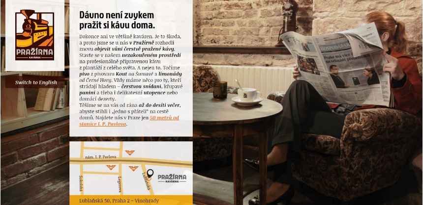
The web is no longer just an information page. In order to attract visitors and sell yourself or your product better, you need to arouse emotions . The fastest way to grab the attention of your site visitor is the large cover image . A concise photo of your products or focus will say more than the text and the user will know right away where it came from. Photography in the right mood will give your business a clear face.
If you offer products or services in your own establishment, show off with photo gallery . The customer will see in advance what he can expect and you can tune in or excite him. Don’t be afraid to invest in professional photography that can make a customer ultimately buy
with you, not the competition.
2. Well-chosen typography and font style
The font style selection should match what you are dealing with. Should your website be fun or serious? Do you want to evoke a romantic mood, drama or look elegant? The font style completes the whole page mood .
If you’re looking for a nice font for your site, Google Fonts today offers lots of original styles for free.
Font size also matters. Larger fonts emphasize the primary message on the page, while smaller ones naturally draw attention to the main message. This creates a hierarchy that supports website understanding and helps users find the content they need.
3. Concise
In the current stream of information, it is necessary to be brief and provide only the essential data leading to the goal – this is usually the purchase of your services / products, read your blog, a phone call that brings you a new job or a visit to your event. Forget lengthy introductions like “Welcome to my dedicated website”. Dedicate attention to the essentials , ie
-
- create awareness – your focus, what you are good at, can often express a slogan that you or characterizes your products
- arouse interest – why customers should choose you, how you differ from the competition
- arouse desire – show customers the results of your work, provide references and support your credibility and professionalism
- encourage action – give website visitors the opportunity to become your customers, ideally placed action button (for example, “book a stay” or “this I want to ”)
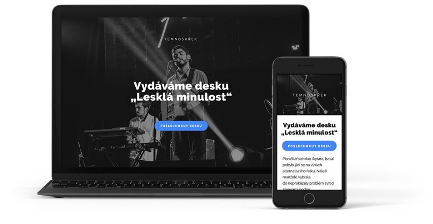
4. Single page without bookmarks (single page)
This trend was started by mobile phones, where due to limited space for communication, navigation wins by scrolling (scrolling the page from top to bottom) over switching between tabs in menu. It turned out that everything a customer is willing to read about your offer can be easily presented on one page. Even on a regular monitor. If you dose the customer information correctly (see the previous point), it will be natural for him to draw it by reading the page from top to bottom and you will not need navigation tabs. More complex content should be separated by headings. Take a look at one nice example of this trend.
5. Customer interaction (action buttons)
Action buttons are an integral part of every modern website today. People are used to using buttons on a regular basis, whether to get information or to express an opinion, such as “I like it” on Facebook. Action buttons help you gain a customer or provide additional information for a decision. For example, their location on the web will allow you to redirect the customer to your Instagram photo gallery, display a video of your lecture on youtube, or send you a reservation or request directly from your site.
Where on the web to place such a button? Of course, it depends on the length of your presentation. It is generally recommended to insert the button immediately on the start page (above the fold). So that the user can see it before he starts scrolling. We often make emotional decisions based on first impressions. The button located in the introduction also serves as a quick action for visitors who come repeatedly. It is also a good idea to repeat the button below the page after you have given the visitor enough information about yourself or your products or services.
6. Mobile Impressions (Responsiveness)
Viewing your website on a mobile or tablet is a matter of course, without which a modern website cannot do without. Roughly 20% of visitors in the Czech Republic come to the website from mobile devices and this trend is rising every year. Google-optimized sites also favor Google when searching. It means more visitors for you.
Now you know how to do it. You can try all the recommendations straight away and you don’t even have to be a designer. Web business card DOMENA.cz is free and meets all the above principles. You can click your own website in 15 minutes.