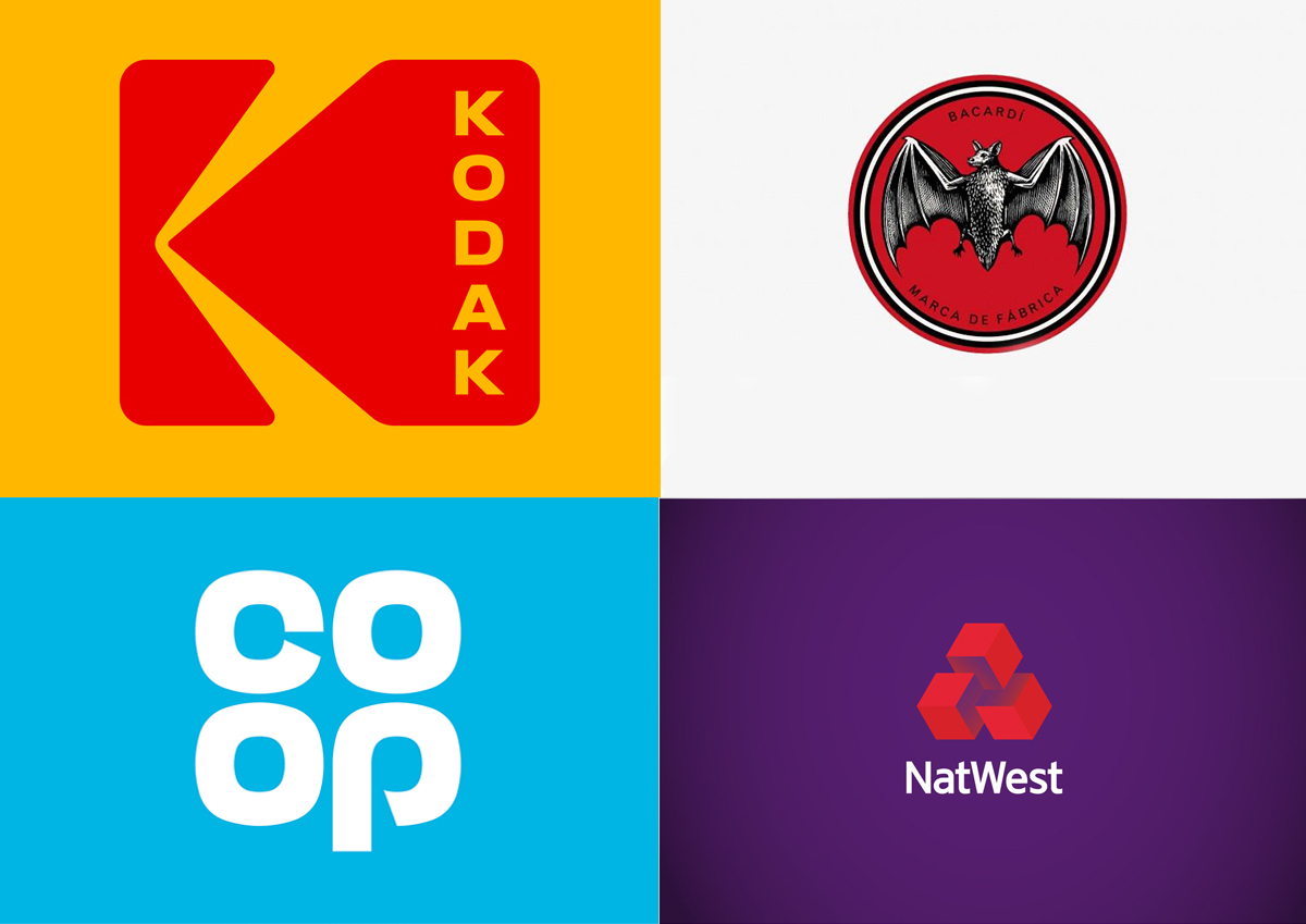
A dynamic market puts forward new requirements, so brands must change their strategy and image in the eyes of the audience. A new trend in the world of logos – retro rebranding. The world’s leading companies are returning to the previous versions of their corporate identity. We are publishing a translation of the DigitalArts article “Why Logos Are Getting Retro”.
The agency responsible for Kodak’s retro rebranding, the designer who helped Coca-Cola get back to its roots, and others talk about why brands choose old logos over modern designs and list cases where this is useful or not.
Brands have to adapt and change their logo to adapt to erratic consumer tastes and modern realities. Sometimes a brand can lose its identity due to too intensive changes. Companies that have been on the market for a long time can get more from returning to the classic style, than from leaving it. This year we have noticed a new trend emerging among large companies such as Kodak, Co-op and NatWest. When it came time to update, they decided to redesign a logo from the past rather than create a new logo.
Historical logos can associate a brand with nostalgia, experience, and past knowledge that will set it apart from younger competitors. In parallel with this trend, the number of authentic, hand-crafted logos from the 1960s and 1970s is increasing. In a world where consumers are offered a myriad of digital design logos, this is a fresh trend.
We wanted to find out what designers think about rebranding in the spirit of nostalgia, and how it is perceived by modern consumers.
Rebrand the logo: retro style
This year, Kodak brought back its first official symbol , created by designer Peter J. Oestreich in 1971. It has been in use for over 35 years.
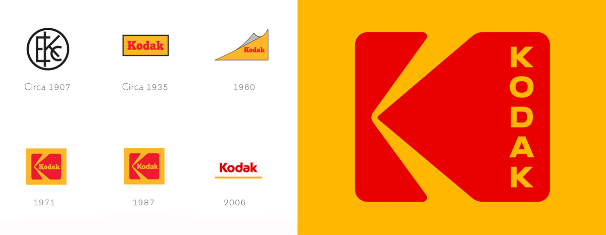
Design duo Work-Order revamped the 1971 symbol and laid the Kodak lettering horizontally, using references to film perforations and street signs. Work-Order also decided to restore the power of red, yellow and black used on packaging and in Kodak marketing materials since the 20th century.
Work-Order partner Keira Alexandra claims this is due to the integrity and purity associated with the brand’s long history.
“I will not say that this is about nostalgia. Rather, it is a return to the roots and foundations of the company, a demonstration of commitment to its mission. If the company is strong and has a valuable legacy, use it “.
Kodak CMO Steven Overman emphasized on Work-Order’s website that “the 1971 logo redesign was not a return to the company’s previous identity, it didn’t go anywhere.
“It is logical to keep one of the most famous logos at the head of the corporate identity and image of the company ,” he says.
But is it just “logical”? Or is it a return to values strategy in a market where brands that have been around for decades have to counter the influx of startups?
Co-founder of Vault49 Branding Agency, John Glasgow, claims that this is a growing trend that concerns not only companies but also fashion, music, sports and culture.
“This is especially true for brands that have a long, rich history, like Bacardi. They look back on their precious heritage and re-embody early ideas, logos, fonts and brand identity. ”
It is worth conducting an effective logo rebranding in a trusted branding agency. KOLORO knows which trends will make your company’s symbol attractive to customers.
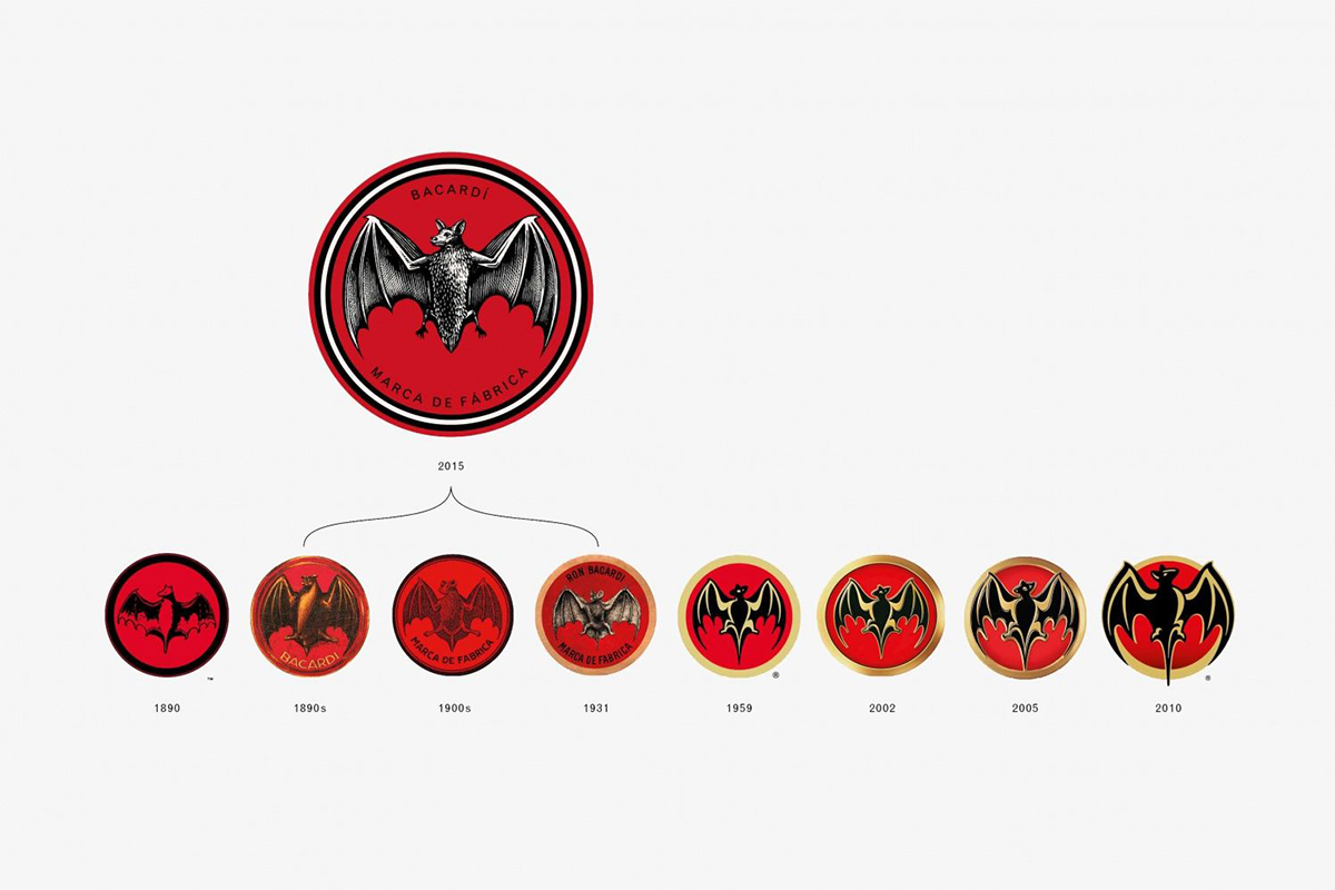
In 2014, Heredesign used the Bacardi bat logo (used from the 1890s to the early 1900s) to provide inspiration for existing designs. The studio claims they wanted to rebrand Bacardi, based on the company’s history .
“It is also an opportunity for brands to leverage their strengths, to differentiate themselves from competitors and startups that do not have 25, 50 or 100 years of experience in improving their brand, product, service,” says John.
Design luminary Bruce Duckworth, who has led Turner Duckworth and D&AD for 24 years, says that when a brand’s history is forgotten or revisited, it is best to go back to our unshakable origins .
“Brands are always looking for ways to stand out and become relevant to consumers. If you add their history and experience to their legend and identity, it’s worth reminding clients of this. ”
To order a logo rebranding that will attract a new audience and increase brand loyalty to the existing one is worth at KOLORO. With us, your brand will acquire a new face!
Bruce was rebranding Coca-Cola when he decided to take advantage of this trend.
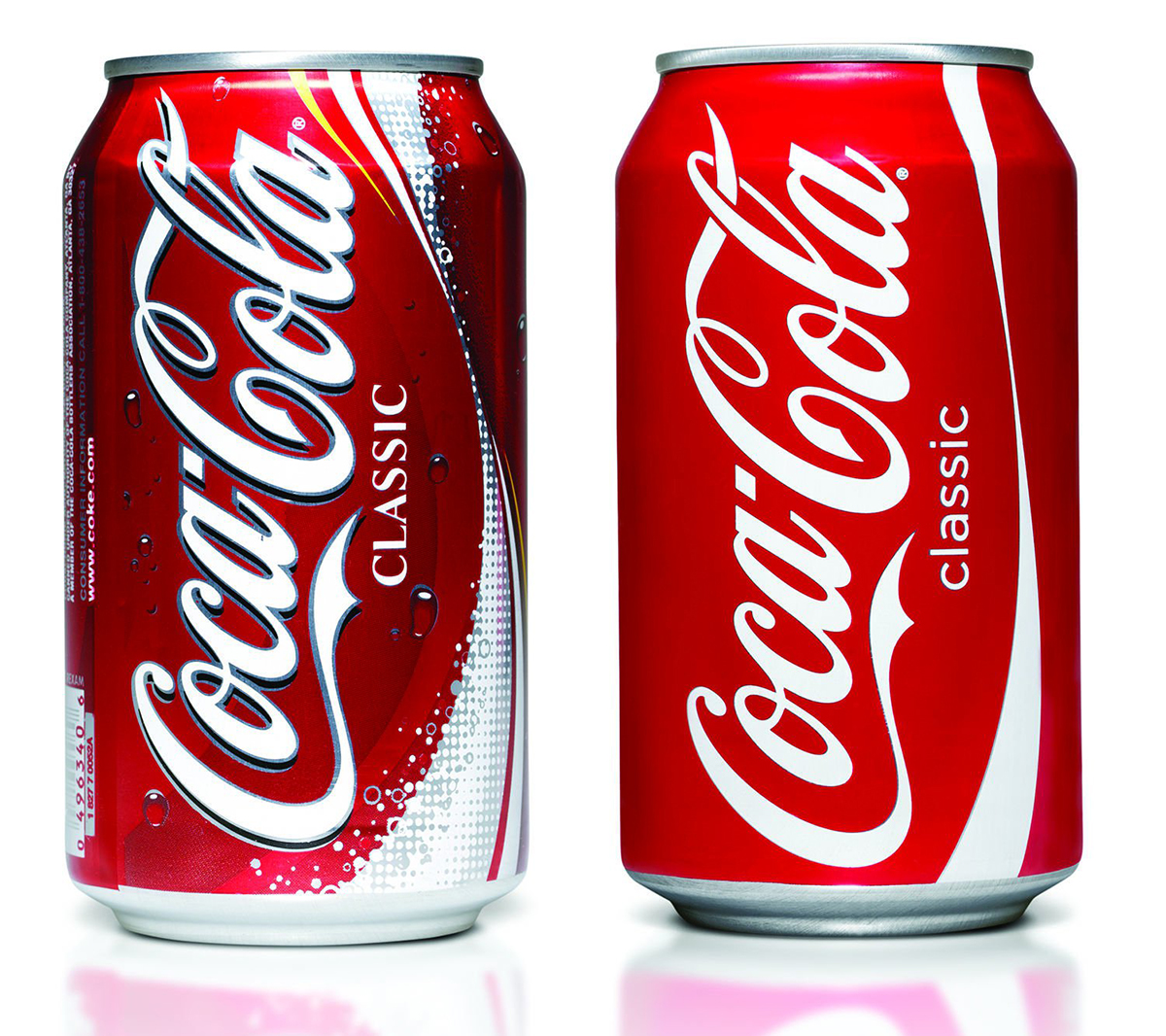
“The brand has lost its characteristics and has ceased to be noticed. The success of the work done was that the changes did not concern the past of the company, but were based on the unmistakable properties of the brand . It was a redesign for the future that is successful in today’s world and the users loved it, ”he says.
“It piqued the interest of younger users, and for older customers, the brand looked fresh and welcomed like an old friend.”
Will the retro logo rebrand benefit?
We cannot say that this trend is completely new. An early example of this is the BMW Mini relaunch of the iconic 1960 Austin Mini. BMW sold the Rover Group in 2000, retaining ownership of the Mini, and in 2001 it decided to promote its vision of what a modern Mini should look like. The design of the car combines old and new elements.
“This is the key to success. Building on romance and nostalgia from the past, the new design incorporates all the benefits of the modern world. The best of both worlds, ”says Bruce, who has always loved Mini’s work.
But this only works if the original design resembles the classic and is devoted to it – like NatWest’s.
This year, the UK bank returned to its 1969 logo design, which was based on three connected cubes and represented three banks connected together at NatWest. Despite at least 4 redesigns in 47 years of the bank’s existence, three elements remain a classic feature of the brand logo.
The return to 3D cubes was a deliberate attempt to have a sign that would be understood in terms of digital identity . The modern vibrant colors and animated elements were an attempt to associate the new design with modern cans rather than traditional ones.
Futurebrand, the agency that rebranded NatWest, noted on its news blog that NatWest was more courageous than conservative high-status companies.
Does your company need rebranding, you can find out in our material.
Does it work?
John argues that the element of nostalgia is most effective for a brand that has a gap between the company’s past and the present .
“This can be done through color, shape, or how the classic logo is adapted and embedded into the existing branding system,” he says.
“I think Gen Z is receptive to this and appreciates brands that have a history , experience and represent themselves in the modern world. ”
He argues that communication through brand heritage is valued today – users are more receptive to an identity that looks clear and truthful than a message hidden under floors of detail.
People prefer the craftsmanship hidden behind the symbols of the past to modern technical logos. Vault49 focuses on ideals more than the process of creation, which sets their company apart from others.
Brands understand that their users want to be part of an open and honest conversation and not see artificial effects and other distracting gimmicks, ”says John.
“In the process of simplification, brands are getting rid of the plump and lurid 3D effects on their logos and trying to look cleaner. I predicted that more and more brands would go through the same process to keep up with the increasing trends. ”
This may be correct for several reasons, says Bruce. “ Design only works when combined with the brand . Simply reworking an old logo without a good reason will not be effective. ”
If you have not decided whether to rebrand , our article will give you important reasons to do so.
Logo redesign: simplicity
In parallel with the trend of historical logos, is developing a trend dictating the simplicity of the logo .
Recent rebrands of leading companies such as Deliveroo, Subway, Instagram and Mastercard have replaced skeuomorphism on vector logos.
“I believe users are looking for brands that are easy to understand and make their lives easier. Skeuomorphism can look artificial, and people are looking for the available truth , ”says Bruce.
Bruce argues that there is often an opposite reaction to this trend, with the crafting resurgence playing against digital artwork in recent years. “Handicraft is proof of human ability and this is the trend we have seen lately.”
One of the newest rebrands based on a return to the classic is Co-op.
Co-op returned to the simple cloverleaf logo design from 1968. Design chief Ben Terrett said that “ going back to the previous logo was simple and memorable , this decision is not unusual.” The reaction was positive, as people faithfully remembered the four simple letters and the lines that they symbolized (clover).
Despite the fact that 2016 was not the first year that brands decided to return to old logos and give them a fresh look, it is obvious that is a trend that is aimed at the heart of modern audiences who value truth and simplicity . In a society trained to criticize advertising and its message, skillful work and experience resonate.
“If you have it, why not use it?” John says.
It is necessary to order a logo redesign at the right time . Don’t wait until your company is no longer perceived by the audience. Contact the KOLORO agency and we will help you rethink your experience and translate it into a logo!

